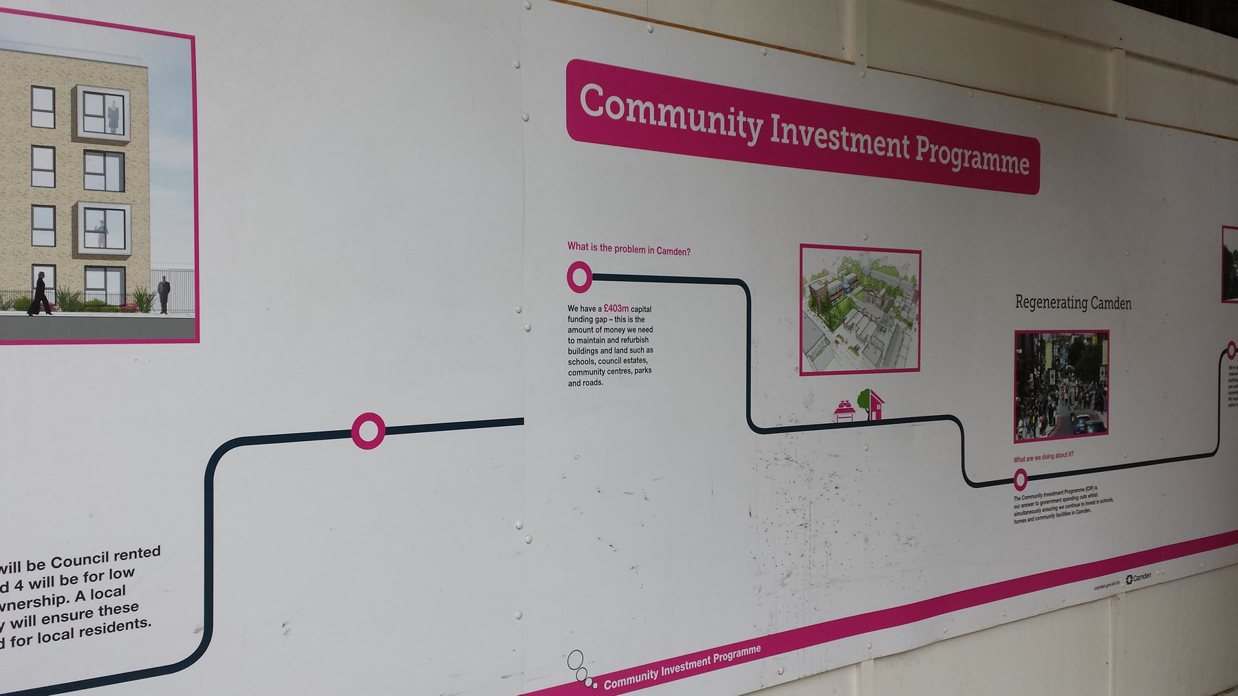
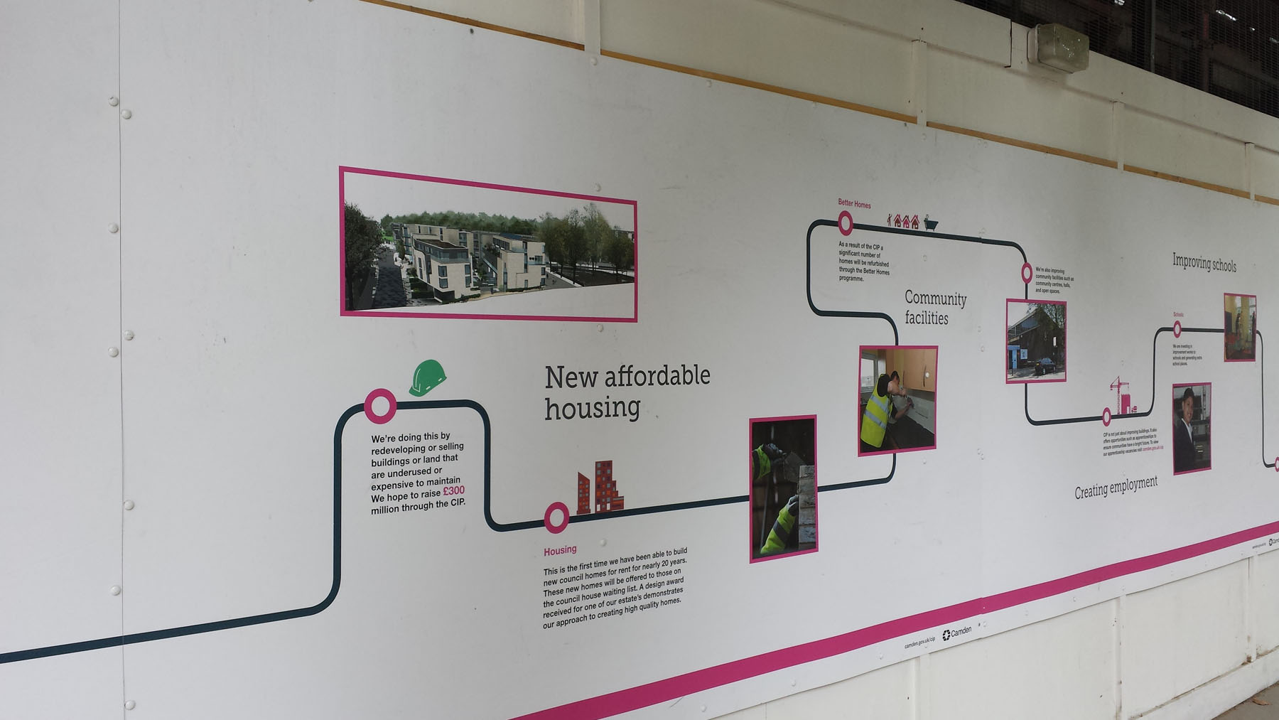
Not far from Camden is a tube map on the wall of a housing development, showing not trains, but a timeline.
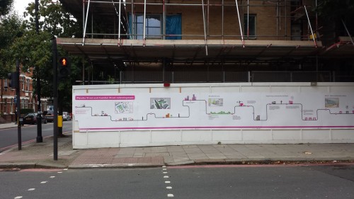
Phase one of the Plender Street development is due to be completed in November 2015, but while the hoardings have been up, they’ve decorated the outside with an information board about what is going on.
And done so in the form of a simple tube line map.

You could look at it as a cute way of providing information, or a clever use of symbols that local residents would be very familiar with, making it easier to understand.
However, the “station” asking what is the problem in Camden does seem to be amply, if probably accidentally illustrated by the fact that the tube lines don’t line up.

Hopefully the building isn’t as disadvantaged.

SUPPORT THIS WEBSITE
This website has been running now for over a decade, and while advertising revenue contributes to funding the website, it doesn't cover the costs. That is why I have set up a facility with DonorBox where you can contribute to the costs of the website and time invested in writing and research for the news articles.
It's very similar to the way The Guardian and many smaller websites are now seeking to generate an income in the face of rising costs and declining advertising.
Whether it's a one-off donation or a regular giver, every additional support goes a long way to covering the running costs of this website, and keeping you regularly topped up doses of Londony news and facts.
If you like what you read on here, then please support the website here.
Thank you