Just a bit of random weirdness that you sometimes notice when stuck on a railway platform for 20 minutes waiting for a delayed train.
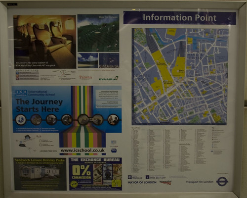
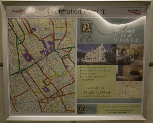
The southbound platform for the First Capital Connect service at St Pancras has two of those quite useful local area street maps in poster displays. One is at the bottom of the escalator, and the other is a bit further along the platform.
Yet, curiously, they have totally different maps on them.
How odd.
Maybe they switched map suppliers and didn’t feel the need to keep a level of consistency when updating them? Or maybe in that arcane way that railways are run these days, the maps are on parts of the platform managed by two different companies?
And of course, if the train had been on time, I wouldn’t have been wandering around bored enough to have noticed this little oddity.


I’ve noticed this kind of stuff around London too, it drives me mad.
It’s odd but the top one is a TFL maintained board and the other is network rail. But why do they get the underground ones in the train station? It is stilly but personally I prefer the TFL info and maps, much better design.
The upper of the two pictures has TFL branding on it, the lower has Network Rail branding so I suspect that is the reason.
“Hello left hand, let me introduce you to the right hand…”
More hand and foot, they work together but independently.
They both have contracts with different map suppliers to produce maps for their staff and customers. The second one is an OS map for instance.
A consequence of the changing system where other companies offered their services for less money in the 90’s.
There ought to be maps of the best way to get out of tube platforms as well.
When coming off the Piccadilly line at Kings Cross and wanting to get to the surface as quickly as possible, NEVER follow the “way out” signs that take you on a route march via St Pancreas, but follow the Northern Line signs that go straight to the old escalators and straight to the surface!
There are usually very good reasons why they send people around the long way out — and it’s usually to do with crowd control and safety.
I have worked on several London based stations and yes the signage is all to do with pedestrian flows/Legion modelling and station operations.
Signage is used to encourage passengers to take the route that will most efficiently move large crowds of people around the station (not necessarily the quickest). It is understood that in time regular users of the station may find quicker routes, but if all passengers used this route it may potentially cause congestion, cross flows and queues.
The new Kings Cross/St Pancras complex does look pretty and has lots of shops, but so many corridors! The underground corridors now seem endless – changing tubes now takes ages, as I don’t do it often enough to remember the shortcuts.
I remember the first time I went to Victoria from Kings Cross after they opened and it took an extra 10 minutes due to the tunnels.