Slightly earlier than expected, the new tube map has been revealed, which has seen a swathe of orange invade the east, and the first section of what will be the future Elizabeth line comes into action.
With TfL’s growing control over the mainline railways, the tube map, which was always mostly tube lines running in fresh air is now dominated by the surface instead of the underground. How long before the reality matches perception and the cover artwork ceases to refer to it as a tube map? But existentialist ramblings aside, what has changed on the map itself?
Fortunately, comparing old with new is quite easy as while TfL have updated their website map, they haven’t updated the old pdf file.
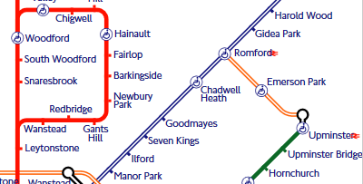
The most obvious change is the arrival of more London Overground, as TfL takes over some of the West Anglian Suburban Lines from the end of this month.

That adds a whopping 28 new stations to London Overground collection, although as at Euston, its more of a couple of platforms at Liverpool Street rather than a major rebranding of the station.
- Bethnal Green
- Bruce Grove
- Bush Hill Park
- Cambridge Heath
- Cheshunt
- Chingford
- Clapton
- Edmonton Green
- Emerson Park
- Enfield Town
- Hackney Downs
- Highams Park
- London Fields
- London Liverpool Street
- Rectory Road
- Romford
- Seven Sisters
- Silver Street
- Southbury
- St James Street
- Stamford Hill
- Stoke Newington
- Theobalds Grove
- Turkey Street
- Upminster
- Walthamstow Central
- White Hart Lane
- Wood Street
Another new line for the “tube” map, is a short shuttle line linking up Romford to Upminster. With a lot of people relying on TfL’s map, having that line appear on the map at last may help a lot of irregular users avoid lengthy trips into London and back out to get between the two regions.
And, finally, a new line appears in a colour other than orange — in almost but not quite Crossrail colours, the future Crossrail line between Liverpool Street to Shenfield.
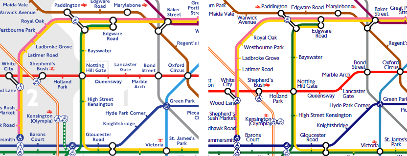
That service is being initially branded as TfL Rail until May 2018, when the Crossrail tunnel opens and trains will run as Crossrail. Then the blue line will turn purple. More line changes, as the Central Line gains a kink over at Marble Arch to allow more space for the reshaped Hammermith/Circle lines between Paddington and White City.
Stratford International also gains a bit more curvature.
But, have you seen what’s been removed? The shaded green link between Kensington Olympia and High Street is gone. The railway map has also lost the only service that it used to show which was emphatically not a railway. Although the stations are still there, the Dangleway is no longer visible as a line on the map.
Talking of stations, how have the blobs fared?
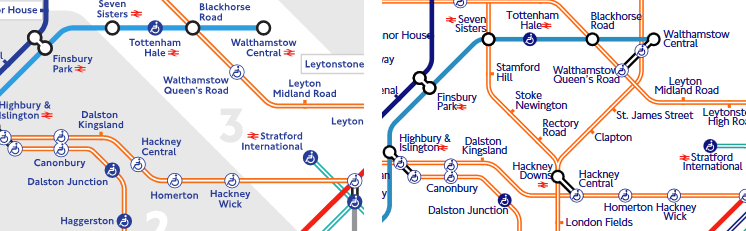
Walthamstow gets a massive triple-blob to link up with the two lines passing through Walthamstow Queen’s Road, made possible by the recent opening of a footpath between the stations.
Hackney Downs is now blobbed with Hackney Central to mark the reopening of a long closed link between the two stations.
Wanstead Park in now linked to Forest Gate although there is a decent walk along the main road between them. Curiously, considering the distance between those two stations, blob-less though are the two stations at Bethnal Green, both with the same name, and barely a road crossing between them, but severed on the map.
A curious choice indeed.

And finally, if you turn off the page style (css) in your webbrowser, the new tube map looks like a word cloud of railway station names, which has a curious beauty to it, and will probably end up in an art gallery one day.


There’s actually a reasonable distance – about half a mile – between the two Bethnal Greens. It’s not the most obvious transfer, either.
I stand corrected, got my stations/lines confused.
Do my eyes deceive me, or have they taken the zones off?
Ian, do you know if the rebranded Overground Line from Chingford will get dedicated platforms at Liverpool St St?
And the district line has disappeared from Kensington Olympia…
The new font is terrible, makes the map appear more crowded, and it is not like the classic Johnson font either. TfL is really letting it’s standards slide…
The new online map is going to be constrained by the fonts available on your computer. I don’t have Johnston New Type on my computer, hence the map is not shown using it.
Jakob Hartmann
No
The various services into the low-number platforms will operate almost as before – it cannot be otherwise.
The new map is very distracting, as the “new” services are not separated or named – see a recent “Diamond Geezer” post on the subject.
Tufnell Park on the Northern Line is also marked as closed until next year….must be annoying for the people there.
District line to Olympia is back!