The Natural History Museum has decided to commission a new logo that it will be using in the years up to its 150th anniversary in 2031.
Evolution of the logo
The new symbol which appears on the Museum’s digital platforms this week and is being introduced across all collateral in the coming months is made of a circular formation of the letters NHM.
We’re told this represents the earth and the “universal connection between everything in nature”. We’re also told that it “represents the energy of a ripple effect, which pulsates from the centre to form a three-colour sunburst”, although most of the uses of the logo so far have been in plain black text only, so not very colourful.
Quite interestingly, they will be using the logo as a background image in their marketing graphics, showing this is a wider rebrand of all their marketing, not just a logo swap. It’s a nice idea albeit one that can cause problems in the long term as it can be quite a struggle at times to secure suitable images to use if they need to blend seamlessly with a dominant brand message (painful personal experience there).
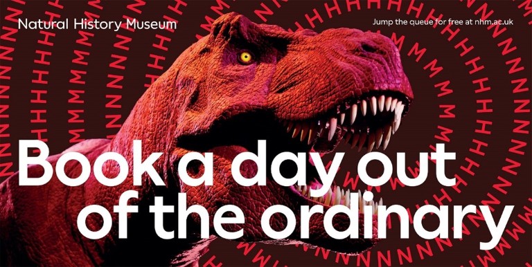
The new symbol will appear on the Museum’s marketing campaign later this month (c) NHM
There’s also a new typeface for the museum, NHM Wallop — a custom version of Displaay Type Foundry’s Wallop typeface.
The museum says that it worked with creative agencies Heavenly, Pentagram Design and Nomad Studio on the project, supported by its internal design, marketing and digital teams to create the new brand.


It’ll be interesting to see how they make use of the branding throughout the museum. Hopefully, it doesn’t become too overwhelming. I am a fan of the look of the new campaign, however.
Whilst it’s better than the deathly dull one we’ve had since 2015, was t the original just fine…
Hopeless, frankly. I haven’t been to the NHM for years but on visiting the Science Museum this week I noted that the subway exit to the NHM is closed; some works are being done above ground but couldn’t see what
Another startling waste of money from an organisation that is always crying out for evermore of our money. How many people will see this and think “Oh I must go to the Natural History Museum because this is just such a stultifyingly boring new logo”? I would be surprised if it was in double figures to be honest.
I wonder how much money they wasted on that? Do they really think that a new logo, or any logo, makes any difference at all as to whether someone visits the Museum or not? Or maybe somebody’s son/daughter wanted the commission??? (Okay I admit to being a cynic)
What a complete waste of the funds that they tell us they don’t have enough of…
Personally I really liked the capital N version that was done by Hat-Trick in 2004. (not in 2015 as stated at the top: https://www.designweek.co.uk/natural-history-museum-scores-with-hat-trick-logo/) it will definetly age better and it’s flexible enough to update campaigns to be the visual fashion of a time if it is so important to go for the instagram aesthetic like they have with the new version.
This new one looks disjointed like it was done remotely during lock down by 3 different design teams not really working together. It’ll need re-designing in a few years yet again as they have boxed themselves in to approaching the project as a green field site.