When the now classic Harry Beck designed tube map was first released in the 1930s, it proved so popular that a version – complete with tube roundel – soon appeared on the other side of the world, in Sydney.
A rare copy of the Sydney map is now being offered for sale by London-based map specialists Altea Gallery.
Sydney railway map (c) Altea Gallery
Sydney railway map (c) Altea Gallery
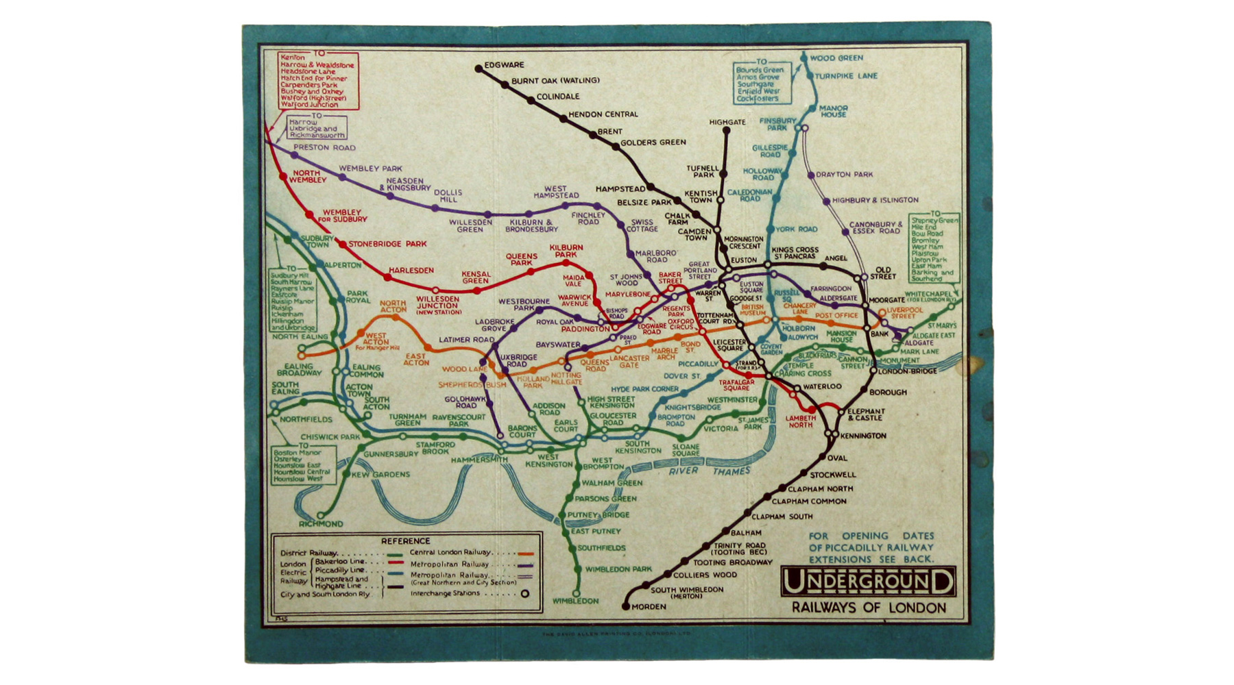
Prior to Beck, although diagram style maps had long been used inside trains — similar to the ones in tube trains today—most wider network maps were still geographic in style, often laid out over actual maps.

Central line postcard – circa 1904
There were moves towards diagrammatic representations, though, and the earliest is thought to date to a poster from 1900, showing the rail routes from the ferry service at Harwich.
A very good history of the development of railway maps has been written by Andrew Dow.
Andrew outlines the evolution of the railway map as a diagram from about 1900 onwards. Within a decade or so, British railway companies were increasingly using diagrams rather than maps, but not the London Underground.
London Underground map 1932
With the geographic link increasingly broken, Beck’s key insight was to even out the gaps between stations, which still tended to represent reality. The long gaps between stations at the edges of London were shrunk, and the short gaps in the centre enlarged—a bit like putting a magnifying glass over the centre of the map.
That allowed the map to show the entire network without being cramped and unreadable in the middle and having vast expanses of empty space around the sides.
The initial run of trial maps was released in 1933, and well, it’s never looked back.
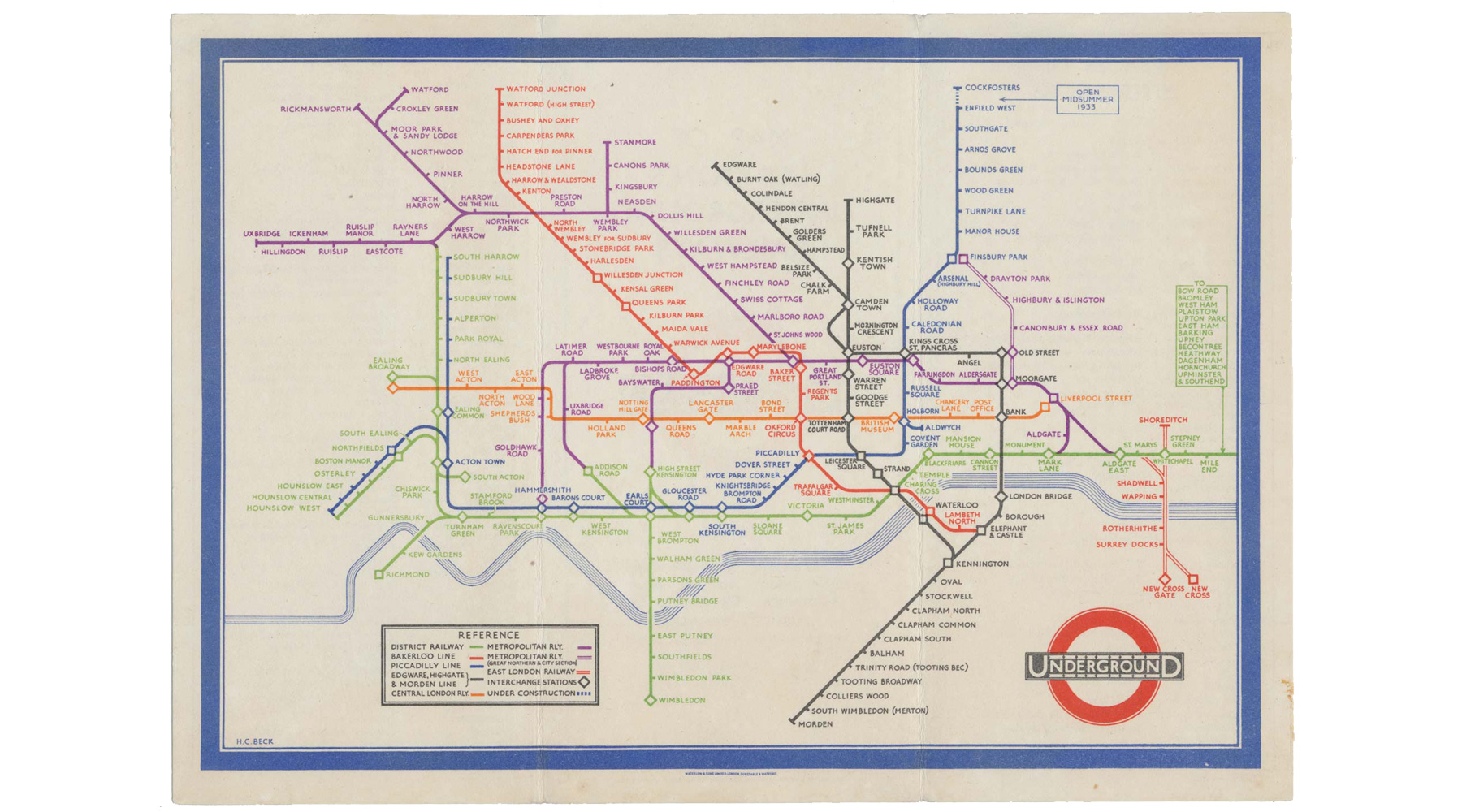
London Underground map 1933
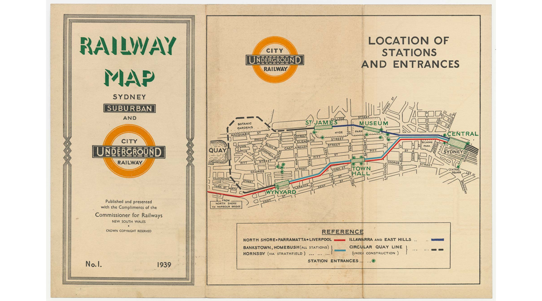
Other countries started to pay attention to this novel way of showing the transport network, and one of the earliest was the other side of the world, when the Sydney Metropolitan Railway issued a Beck-inspired map. Although Harry Beck had been contacted by other cities, notably Paris in the 1930s to assist in map design, it’s unknown if he was involved in the Sydney map.
It’s either a lost direct link with the London Underground or, ahem, a rip-off of the design. That it might be unauthorised is suggested by the use of the London Underground style roundel, which it’s unlikely to have been approved.
The Department of Railways, New South Wales, issued the map in 1939, and aside from the Beck-inspired layout design, the cover of the map also looked remarkably similar to the Beck 1938 map cover.
Sydney railway map (c) Altea Gallery
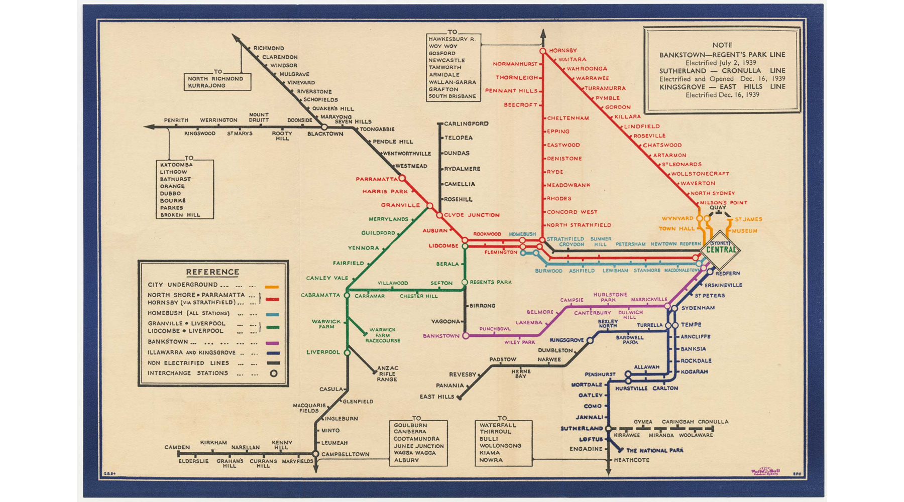
However, while the new map format was popular in London, it proved less popular in Sydney. Although often described as a one-off, there were later versions, such as this one from 1939 and this one from 1953 —minus the London Underground logo. The diagram eventually won out though, and today most cities use diagrammatic maps for their public transport networks.
However, Altea Gallery currently has a rare copy of the first edition Sydney map for sale, including that possibly errant tube roundel.
Sydney railway map (c) Altea Gallery


The Sydney map of 1939 looks geographically accurate. In practice, the 1953 map is what we have become used to and tells you all you need to know.
A version of the roundel is still in use at stations in Sydney, such as St James, Town Hall, and Museum.
https://railgallery.wongm.com/cache/sydney-underground/E115_6415_595.jpg?cached=1627001536