No one will care about this whatsoever, but there’s an archive of the maps used inside tube train carriages on the TfL website.
So if you wanted a reminder of what the Jubilee line car line diagrams looked like before the extension opened, then they’re here.

Maybe you want to track the growth of step-free access?

Maybe how the kinks in lines bend over time?

Nostalgic for a Circle line that ran in a circle?
A new airport in 2011?

Maybe you like to collect those badly aligned stickers that sometimes appear on top of the maps?
Such as the time the Bakerloo line was part suspended.

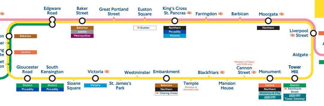
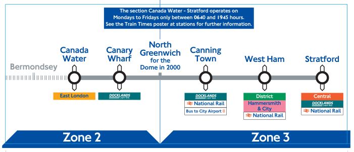
Or the Jubilee line extension opened in phases. Remember the “dome”?
The entire mother lode of stickers and maps are here.
In a way it’s a pointless page of useless trivia, but then again, if TfL didn’t publish them, someone would demand copies via a Freedom of Information request, so they now they can say “just look on the website”.
And now, so can you.


Once upon a time they had separate left to right and right to left versions to go on each side of the carriage, so that the north end of the map was aligned towards the north end of the train.
Not on all lines…. They’d be useless on the Northern line for example!
I was about to comment on the loss of the “mirror maps” but I see I’ve been beaten to it.
Yes, maps always used to be printed for the proper side of the train so that you could confirm your destination by the movement of the train.
Then they did awkward things like turning trains instead of reversing direction — but that doesn’t apply to all lines and there are still too many lines where separate maps *could* be used on both sides, but the current staff are too lazy to organise them.
And yet, TFL produces excellent Accessible London maps where every map faces the direction they are going. Maybe TFL should take over the Underground too.
Oh wait, TFL *already* runs the underground. Maybe it’s time they put their Accessible London teams working on the trains as well as the surface.
You’re right. Not interesting to anyone.
*pencils out entire weekend to look through them all*
😉
I suddenly feel nostalgic for those missing nibs on interchange bubbles.
Given the problems re Crossrail/ Elizabeth Line perhaps we might soon see Abbeywood to Canary Wharf in similar fashion to the JLE !