Observant travellers on the Elizabeth line may have noticed that some of the departure boards above the platform doors have been showing different displays from the usual.
Standard display (c) ianVisits
One of the advantages of modern digital screens is their flexibility in what they show compared to the older LED/LCD based information screens, which lets the Elizabeth line tweak its screens and see if people like the changes, or not as the case may be. The trial ran for a week on a few of the screens at Liverpool Street and Paddington stations and the trial has finished now so that TfL can study the feedback.
There were four changes for the trial.
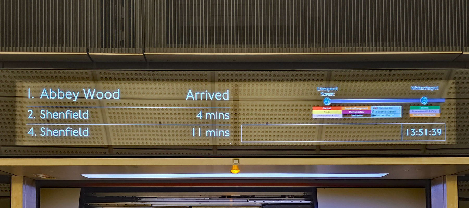
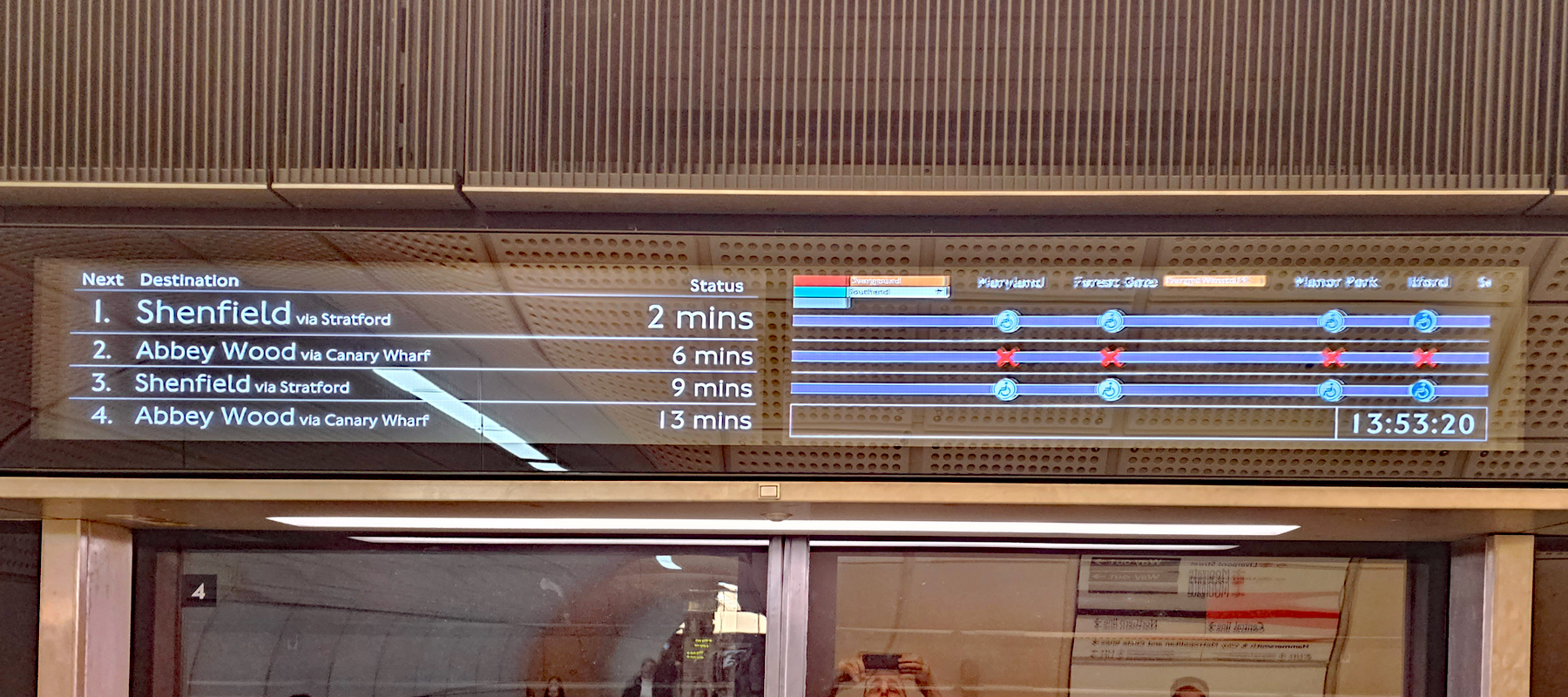
The two most obvious tests showed two different destination screens. At the moment, the screens show the current and next two destinations on the left side, and a scrolling line diagram with the stations being called at shown on the right side.
One test showed the destinations of the next four trains arriving at the station, plus a scrolling display for the next three trains, instead of just the one train as they do at the moment.
(c) ianVisits
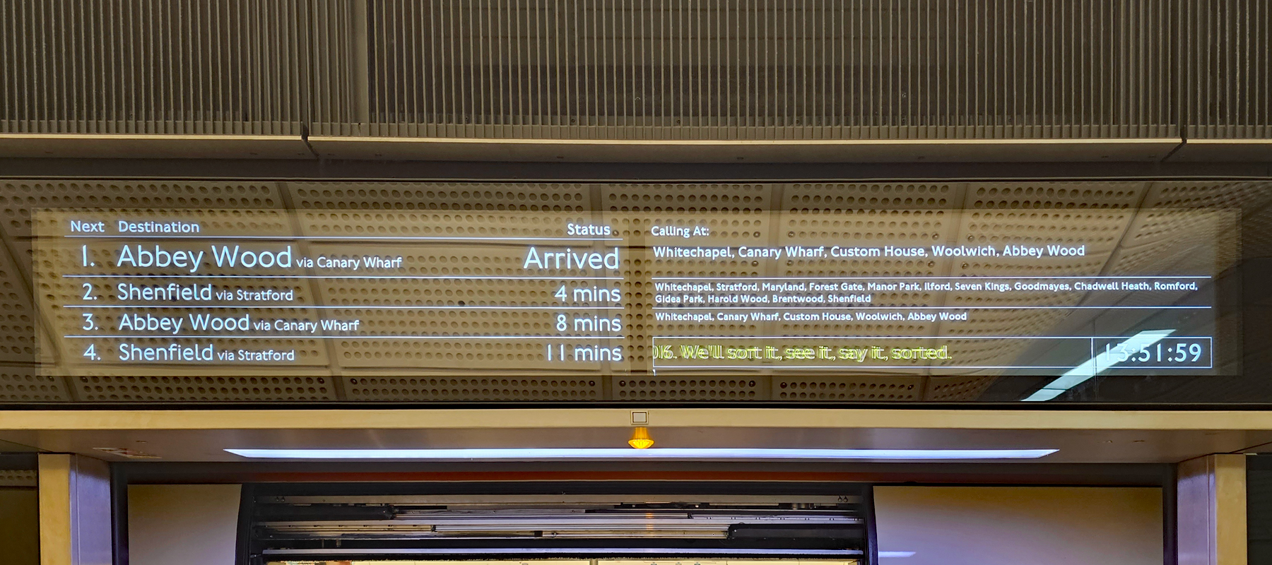
The other test showed two static text screens, somewhat closer to conventional displays at other stations, with a list of the destinations for the next four trains, plus a list of the stations being called at for the current and next train to arrive.
(c) ianVisits
You may also notice that both of the changed destination lists added a “via” message to the left hand side, so plain “Abbey Wood” becomes “Abbey Wood via Canary Wharf” as well.
A third test was a possible improvement on how Heathrow is displayed on the screens, as people often see destinations for Terminal 4 or Terminal 5 and wait on the platform for their destination not realising that it may be quicker to go to Terminals 2/3 and change there – so the trial showed that all trains stop at Terminals 2 and 3 and to board the first Heathrow train then change at Heathrow for T4/T5 if necessary.
There was also a trial of a more straightforward way of showing terminating and out-of-service trains that customers should not board.
The trials finished on 3rd October, and customer feedback is being assessed to see which, if any, of the changes might go live on the Elizabeth line.
Howard Smith, Elizabeth line Director said: “Engaging with customers on what works best for them is important to us as we try to make journeys smoother, and we have recently trialled new ways of making customer information clearer at two Elizabeth line stations. We’re currently reviewing the feedback from the trial to look into changes we can make to improve the customer experience.”


I imagine adding the “via xxx” will be particularly beneficial to tourists. At the moment particularly when heading East it relies on you either knowing the relevant terminating station or having to look at the route map/signage.
As a side note, it would be nice if long term the underground platforms and tube carriages could have their screens upgraded to modern screens. They’re a lot easier to read than the orange ticker screens.
The jubilee line used to just have the destination and one other thing appearing instantly not scrolling which is far better
I suspect it’s for safety, but you can often arrive on the platform and the board just says “Train Departing” when the train is just sitting there – more noticeable when delays and issues. At least still list the trains destination so you know whether to get on or not.
Replying to John, it’s actually even worse than it just saying “train departing” because it also on the same screen shows the destination of the next train which may be different from the train on the platform.
If you’re in a rush and look up you might assume that the train departing is going to whatever station is showing on the screen and jump on the train only to end up going in the wrong direction
It’s helpful to show that most of the Liz Line trains don’t go past Paddington and those that do, don’t stop everywhere.
Londoners are used to their TfL and underground trains being “all stops” – because only Northwick Park, Preston Road, London Fields, Cambridge Heath tend to have these.
.. non-stopping metro trains.
I notice they couldn’t resist the opportunity to shove in yet another see it, say it, sort it message. You won’t be allowed through gate lines soon without proving you can recite it. I really wish railways would remove all superfluous announcements.
I didn’t notice any more security notices than normal and you can’t come to any conclusion about an increase (or decrease) in frequency of messages after looking at three still photos.
It’s ‘sorted’ not ‘sort it’
I may be mistaken but I don’t believe there were security messages on those screens before the update. I may be wrong, but that is how I reached that conclusion: observing a change that I had noticed. Either correctly or incorrectly. I hope that helps.
Thank you Chris. Muchly helpful.
See it , say it , sorted text 61016 😂😂
The 61016 security message has been included in the rotation of scrolling messages since the line opened, and the frequency of that hasn’t changed with the update. The security messages are required to be show/announced at certain frequencies as set out by the DfT – it’s not up to neither the TOC nor TfL .
It’s helpful for those who travel rarely as tourists because of the train where called off or where not. The specific train and the stations where its stopping or not help the travellers to board that train only and will reduce rush time also in the train.
Additionally, the orange screen should be replaced by current All Information screen on all stations.
I hope they correctly indicate whether the train is going to stop at Taplow. it would save me a great deal of unknown – do I do my pickup run to Taplow, or to Burnham, or to Maidenhead because the skipping of Taplow was not clearly shown. Or it changed on the fly…
I did spot these a couple of weeks ago at Liverpool St so thanks for the excellent article! I thought the one with multiple scrolling line diagrams was really confusing. Nothing wrong with showing 4 destinations instead of 3 and the ‘via Canary Wharf/Stratford’ could be pretty useful. I don’t think the Next/Destination/Status headers are necessary and the text could be a tiny bit bigger without them.
I do wish TfL would invest in some better and more plentiful departure boards at Stratford though – perhaps more visible from the central line so people can decide at a glance if it’s worth changing there when going west. It’s such a busy station and it’s probably the hardest place to see when the next train is coming. Another little improvement that would be good there is if the westbound trains stopped a little further back along the platform so that there could be full overlap with the central line trains.
The scrolling line diagram looked so strange. If a Shenfield train was underneath an Abbey Wood train on the list it looked like the Shenfield train was running along the same line but non-stopping until it got to Stratford.
Obviously not the case if you know the geography, but if you didn’t you’d be very confused when you arrived at Stratford in about 3 minutes.
The Elizabeth line signage is a pathetic joke. It is rarely correct. Every week I have an extra 30-60 minutes added to a journey because the signage and platform staff say a train is going to stop at my station while in reality it sails past. Bring back Great Western who were so much more reliable than this rubbish line.
Keep information above the doors simple and in large non scrolling text.
Anything more complicated can go on panels between the doors.
The scrolling line looks confusing IMO , I do however like the calling points think that looks a lot better and the Via Points however before the penultimate stop a “and” would be better so Brentwood and Shenfield , also good for peak delays when trains run non stop to said destination I also think the scrolling line diagram on the train should be scrapped for a scrolling calling points list looks smarter and easier to read for visually impaired etc in my opinion
I’d happily forego all of this nonsense for an actually reliable train service. The last few months have been an absolute horror show from Woolwich, trains constantly delayed or just not turning up despite the platform displays insisting a train is 3 minutes away (which it rarely is). Well over 60% of the time I try to use it it’s delayed to some extent, if not closed entirely. Even if it’s running normally the queue to get in at Woolwich station at peak times clearly demonstrates the demand was not adequately forecast or catered for. The honeymoon period is well and truly over with this mess of a railway line… opened 4 years late and only took a year to fall apart.
The scrolling is the worst of both worlds: you can’t see the info you need when you need it, and by scrolling to show more, it has a strange blur effect which must be an absolute nightmare for those with vestibular/visual impairments.
I don’t know if it’s the software or the screen refresh rate but not a fan of the jumping/jarring when anything animates.
Keep it simple. Don’t just scroll because you can’t design a better interface that is more fit for purpose.