Throughout the land, a new aesthetic has appeared – the social distancing sign – and London’s venues have been busy designing them for the day their doors reopened.
We often give barely a thought to the signs in our cultural venues, telling us where the toilets are, the cafe, the next tour times and the object description signs — but a lot of thought goes into producing them. Voluminous brand guideline documents with rules about which fonts and colours are to be used, and a wealth of experience in how to position notices so that people actually notice them.
During the lockdown, the museums may have been covered in dustsheets, but the back office people were busy preparing for the day that the doors could finally open and socially distanced visitors allowed back in again.
What no brand guideline document would have had though is how to design a socially distanced sign. It’s a new aesthetic that all venues have had to create.
Some have produced functional signs, but some museums have dug deep into their collections to find graphics for their signs, such as the Foundling Museum’s use of a coat of arms that is rarely seen, or the little figure, which adorns the Wallace Collection logo but is now a key element in their new signs.
With no prior templates to work from, for some, it’s been a chance to be a little bit more creative with how signs are designed. Whether a marketing team of one or a whole office, it’s been a challenge to produce signs that are approved by bosses in a tight time frame, spending money that was never allocated in venues who saw their income vanish during the lockdown.
In alphabetical order…
Brooklands Museum
A simple bold sign with the Brooklands Museum branding at the bottom, but a nice touch is how they’ve tweaked the figures to show a male motorist and female fighter pilot – which is apt for a museum of planes and cars.

Brunel Museum
The Brunel Museum has come up with a nice looking silhouette of the man himself, with signature top hat, if in these modern times, no cigar. It’s a nicely branded floor sticker as well, with the circle of the railway shaft and the branding prominent at the top.
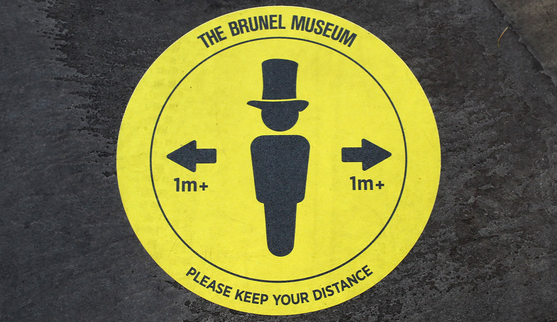
Photo by Tianna Laverock
Charles Dickens Museum
The bold orange colours used in this A4 sized posters by the Charles Dickens museum don’t just stand out against the richly decorated home, but are decorated with images from early Dickens novels, and in a museum with a lot of stairs to climb to go between the rooms, offer a location-specific topicality.

(c) Charles Dickens Museum
Foundling Museum
The Foundling Museum has a simple circular sign they use as floor stickers. The symbol in the middle though is very interesting, and is from the Foundling Hospital’s coat of arms. It shows a lamb above a sprig of thyme, and was designed by Willaim Hogarth, an early supporter of the Foundling Hospital.

Freud Museum
Solid blocks of colour that match the museum’s own primary brand colours, with simple graphics, but topically for the Freud Museum, quotes relative to the signs, about hand washing, keeping your distance and so on.

(c) Freud Museum
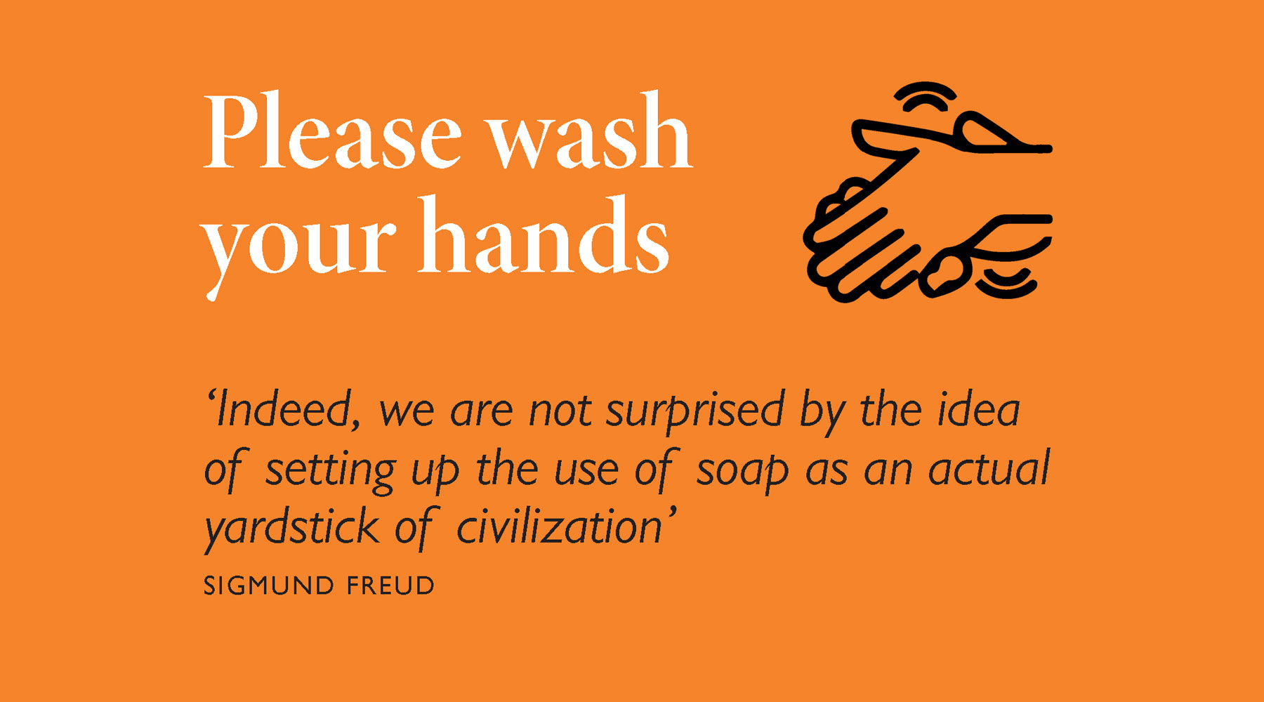
(c) Freud Museum
Headstone Manor Museum
A relatively simple design, a bit clip-arty, but clean and simple message, with the museum brand prominently shown.
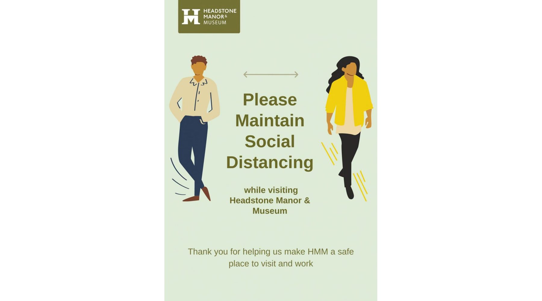
(c) Headstone Manor Museum
Historic Royal Palaces
The Historic Royal Palaces, which looks after the Tower of London, Hampton Court Palace, Banqueting House, Kensington Palace and Kew Palace has dipped into its heritage and come up with signs that reflect what it is all about.
The floor sign shoes look just a bit odd, odd enough to make you want to look closer, and a note lets you know they are based on 18th-century shoes. Wall poster signs turn everyone into a King or Queen. All subtle hints that remind you of the heritage of the sites.

(c) Historic Royal Palaces
London Zoo
How convenient that the average Lion was also 2 metres long at the time when 2 metres was the recommended distance to be separated from each other, so London Zoo went with an amusing design. What would be fun is to see the signs slowly replaced by ever-smaller animals as the regulations relax. When is it time for a meerkat?

Photo by ianVisits – design (c) London Zoo
London Transport Museum
These signs are liberally dotted around the museum, mainly on the floor, with some on the walls by the stairs. Although they don’t have any museum branding in the name of the museum, they are very transport themed, and so fit in perfectly with the museum objects. There’s a slight playfulness as well in the silhouettes of the various forms of transport that the museum shows off.

Museum of London
Fairly basic signs to be honest about it, but there’s a touch of London from the Museum of London on one of the circles.

(c) Museum of London
National Gallery
Politely, it could be said that the National Gallery has gone plain to avoid distracting from the artwork — but it does seem like a missed opportunity, although the shop is selling arty face masks if you like those.

© The National Gallery, London
Natural History Museum
The Natural History Museum has gone for two strikingly different but effective styles – with humour for the behaviour signs about washing hands and keeping your distance, and using very child-friendly dinosaur-themed silhouettes for the wayfinding signs and floor stickers.
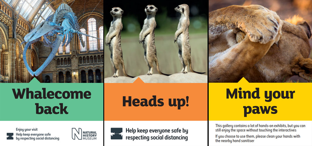
(c) Natural History Museum
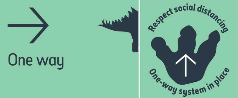
(c) Natural History Museum
Royal Academy
The signs inside the Royal Academy are a playful mix of easy to read messaging on a block of solid colour with freshly commissioned topical sketches based on the artwork inside the gallery itself.

(c) Royal Academy of Arts
RAF Museum
The RAF Museum has cleverly chosen one its star attractions, a Vulcan Bomber to star on its signs, not just as the main logo, but also the messaging is apt for an aircraft museum with flight-specific language in use.
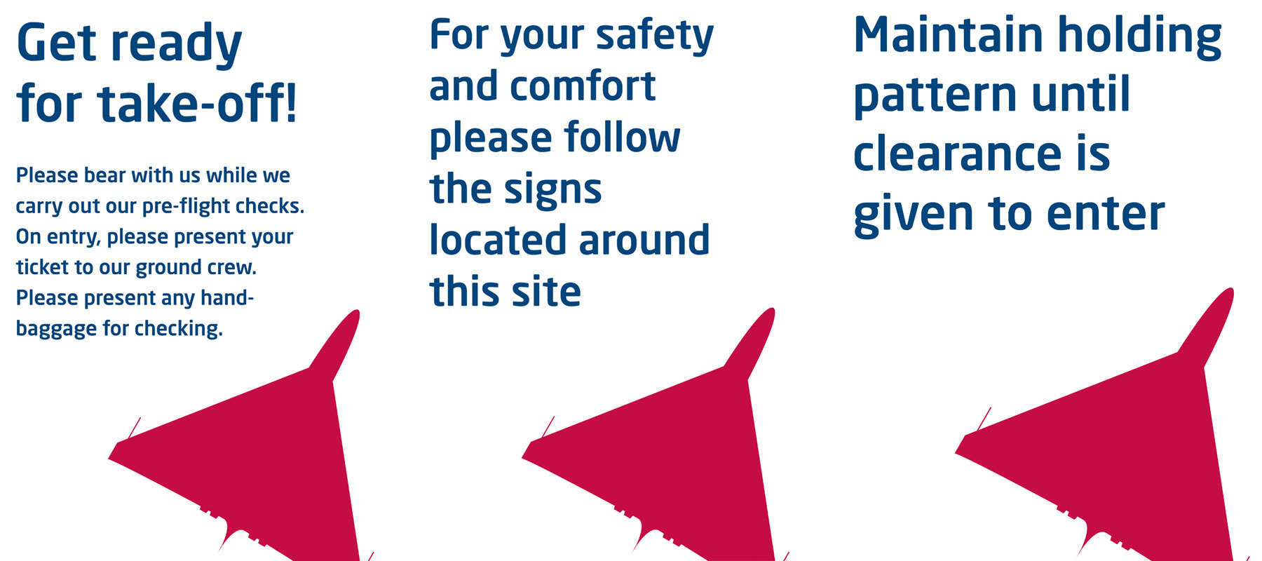
(c) RAF Museum

(c) RAF Museum
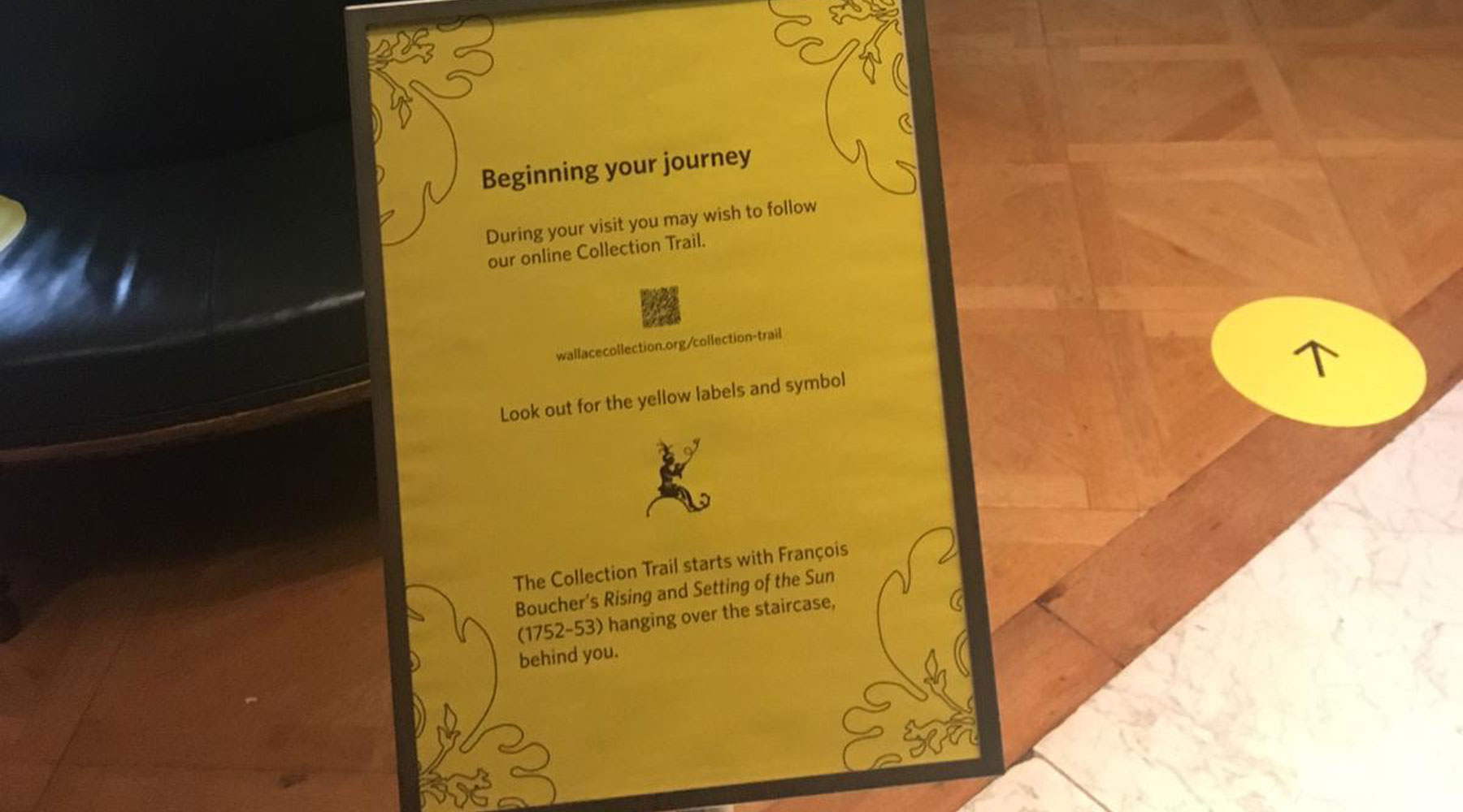
Wallace Collection
The bright yellow signs not only stand out, but the use of solid bold colours helps them stand out against the richly decorated wallpapers of the Wallace Collection rooms.
The subtle nod to the branding is the little chap that appears in the signs. He is also the one that sits on top of the A in the Wallace Collection’s logo – and a figure from a piece of Boulle furniture in the Collection, as a nod to the content of the Collection itself.
Thanks to all the venues who responded with examples of their marketing work.
Updated 19th Oct Added the London Transport Museum


I think taking a lion out with you will guarantee people keep at least 6 feet away. 🤣🤣🤣🤣
While in Florida you have to keep an alligator 🐊 length apart
I think I’d be a bit worried if the RAF started flying real planes 2m apart 🙂
What a delightful collection. Thanks for this article and compilation. 🙂