One of the curiosities about Charles Dickens is how familiar we are with the image of the elderly bearded classically Victorian man we are. No other author of the time is as instantly recognisable.
This is in part thanks to the invention of photography which made making, and later mass printing images much cheaper — but also due to Dickens own understanding of how this new invention could further his own brand image to the buying public.
Over two rooms in the Charles Dickens Museum, this new exhibition looks at how Charles Dickens carefully controlled his image for public consumption. This was a man who regularly writes how much he hated the effort of being photographed and painted, but also went to considerable effort to enable such things to happen.
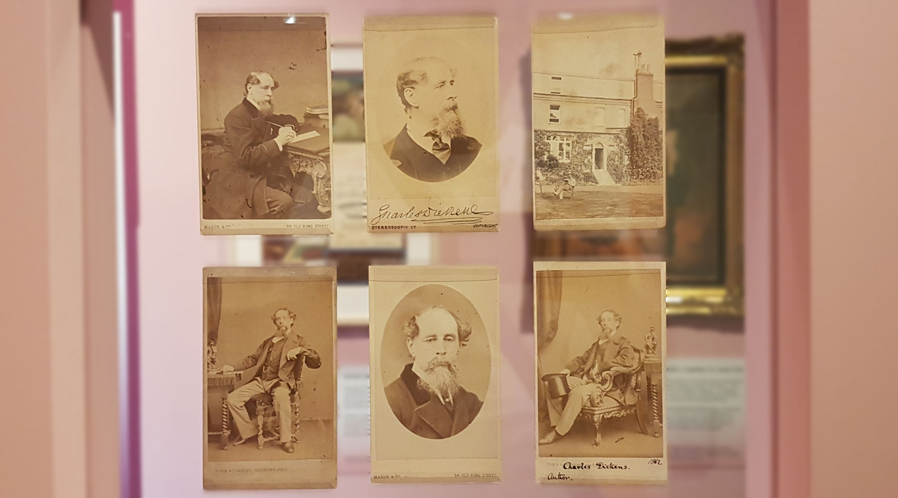
Half the exhibition is mostly monochrome – the images we’re familiar with of Dickens as distinguished author posing for cigarette cards and newspaper articles.
Almost every portrait is posed with books or writing implements, to remind the viewer that this is an author. He even lugged his favourite, and apparently very heavy writing desk to studios if needed to ensure just the correct props are used.
Familiar images of Dickens show him with the grizzled beard and not-quite-a-combover hairstyle, but that look also prematurely aged him.
As a young man, he was noted for his good looks, with “glorious moustaches” and “flowing locks”, even to the point that satirists would compare the youthful Dickens to his older contemporaries. Once he went beardy though, he was described as being “weather worn” and having “somewhat of a seaman’s air about him”.
It’s the second half of the display that explodes into colour, with eight original photographs that have been colourised for the first time.
The Museum researched the details of each original portrait session, the clothes and accessories chosen by Dickens for each and the objects included in the original photographs
The process also involved photography and study of the complexion and skin tone of two of Dickens’s great-great grandsons in conditions akin to the original photography sessions to ensure that the colourisation is as accurate as possible.
The end result is almost shocking.
Carefully displayed more akin to an art gallery, the photos aren’t garish and have retained the muted tones of photography in a dark room, but you can clearly see the dandyish appearance in the green waistcoats and decorative details on the clothing.
Charles Dickens would have stood out in a crowd.

Also in the exhibition is a film showing the work taken by Oliver Clyde to create the images in the exhibition.
As is often the case when work is carried out on an object in a museum’s collection, new discoveries are made. In this case apart from the obvious details that needed to be found about the clothes Dickens wore so that the colours could match – they also found trickery at work.

Take a closer look at one of the photos, as it has been embellished by the photographer — an early form of photoshopping to make the perfect photo.

The exhibition Technicolour Dickens: The Living Image of Charles Dickens is open at the Charles Dickens Museum until 25th April.
Entry is £9.50 for adults, and tickets need to be booked in advance.


Interesting that on the poster outside the building and in the press release spells the exhibition as Technicolour, whereas the usual (correct spelling?) is Technicolor.
Technicolor is a company name — and if they had used that it, apart from the licensing issue, it would have probably resulted in a host of pedants complaining about the “American spelling”.
I’m sure the company hates it, but “technicolour” (lowercase “t”, with a “u”) is well attested by the OED as a genericised term, particularly in compounds such as “glorious technicolour” and “technicolour yawn”. Like hoover, sellotape, tarmac, tippex, post-it. (Cue a bunch of intellectual property lawyers demanding the capital letter and (R) or TM symbols to try to hold back the popular tide.)