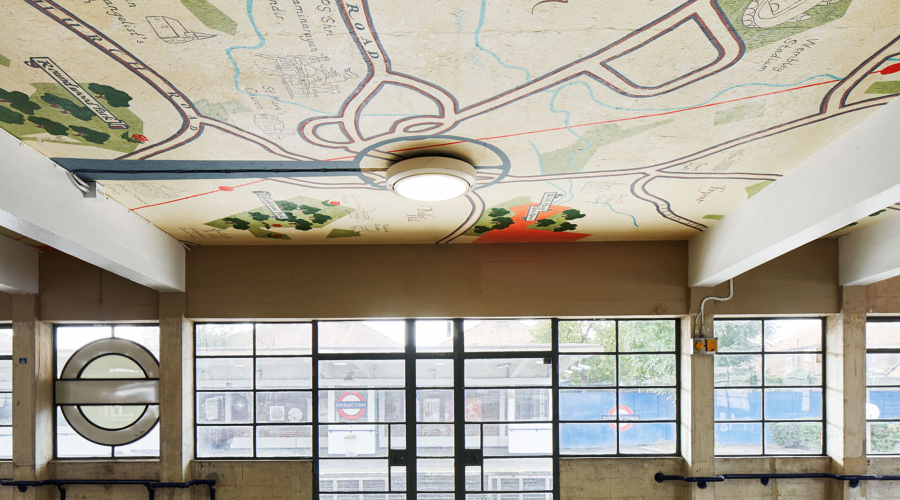
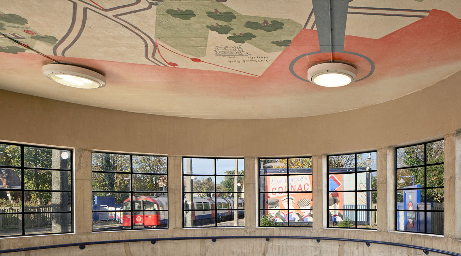
A permanent artwork has been unveiled inside the waiting rooms at Sudbury Town tube station, featuring restyled maps of the surrounding areas, highlighting local landmarks from the past and present.
Lucy McKenzie, Pleasure’s Inaccuracies (c) Art on the Underground
Maps are a recurrent feature in Scottish-born, Belgium-based artist Lucy McKenzie’s practice – which she describes as being “an art form obliged to express data, connected to a specific time and place and combining reality with the imaginative”.
For the tube station murals, McKenzie studied the historical advertising material in the TfL archives and has referenced the work of Herry Perry (Harriet Perry) and RP Gossop.
She chose Sudbury Town station, a historic, listed building designed by Charles Holden in 1931, for the artwork due to the large size of the waiting rooms to work with, and the art evokes a pre-Beck style of map design that would have been familiar to the first users of the tube station. The maps look like they’ve been there for decades and could be from when the station opened, but then look closer and see lots of details that didn’t exist back in the 1930s.

Lucy McKenzie, Pleasure’s Inaccuracies (c) Art on the Underground
The maps also cleverly incorporate the existing ceiling lights in a design which echoes the original Modernist lamps on the platforms.
The commission was arranged by Art on the Underground, and is titled Pleasure’s Inaccuracies.
There is also a temporary related display of large billboards on the platforms and posters installed on a heritage kiosk in the station, which will be on display until November 2021.
There is also an architectural model of the station used when commissioning the artwork which will remain on permanent display.
It was due to be unveiled earlier this year, but was delayed due to you know what.
Lucy McKenzie, Pleasure’s Inaccuracies (c) Art on the Underground

Lucy McKenzie, Pleasure’s Inaccuracies (c) Art on the Underground


Who doesn’t love a map? I love the effort and research by the artist as well. Most of all, it’ll make people look up.
There’s so much to see if you just look up from the paving slabs, so much.
How is that justified in a listed building, merits aside? Part of the pleasure and value of the Holden Boxes is their use of self-finished materials, whilst the minimalism and lack of extraneous stuff was Pick’s principle.
Why treat an excellent example of contemporay metro architecture as if it was a nursery with a mural worthy of a 5th form art project
Who thought this was a good idea..unbelievable piece of indulgent decoration..’Less is More’!
A couple of mean spirited comments above! This attractive mural is perfectly within the spirit of Pick and Holden’s ‘fitness for purpose’ approach to station design between the wars. It looks absolutely appropriate in Holden’s prototype ‘brick box with a concrete lid’ at Sudbury Town and I look forward to seeing it. P & H were not absolute modernists or minimalists and nearly always included some decorative features such as a sculpture, mural, stained glass, tiling and artistic lighting as part of each station design. I’d like to see more of this…like for instance repainting the murals by Stephen Bone which decorated the walls above the new escalators at Piccadilly Circus in 1929. Sadly they were replaced with an Ovaltine advertisement only a few years later when the Underground was short of cash. Now the station could really do with an artistic makeover…
As Vicki from All The Stations would say “very quaint”.