One of the Crossrail stations closest to completion is Farringdon, and there’s been a chance to go down and have a look inside and see how close to completion it is.
When the Elizabeth line opens, Farringdon is going to be an exceptionally busy station. The combination of the London Underground, Thameslink and the Elizabeth line, with over 150 trains per hour passing through at peak times, and connections to three airports, is set to turn Farringdon into one of the busiest interchange stations in London.
As with most of the central London stations, this is a station with two entrances at either end of the long platforms, at Farringdon and Barbican.
The Farringdon station entrance for Thameslink surprised many when it opened, but as my guide, the Interface Site Manager for Crossrail, Kris Sarmidi explained, this entrance was built for both Crossrail and Thameslink, so for the past few years it has appeared to be too big, when in fact, it was future-proofed.
People using the station recently will have been able to peer beyond some of the hoardings down into Elizabeth line territory, but may soon be able to use some of the new station. There is an aspiration to get enough paperwork signed off that they can open the escalators from the ticket hall down to the northbound Thameslink platforms, making this the first Elizabeth line station to open — partially — to the public.
So what will people see when this opens?
The dominant feature of the ticket level entrance is the sloping concrete ceiling, with the diamond supports — except that the supports are not supporting anything, they are a design feature and add no structural strength whatsoever. Some sort of design was needed though to avoid an otherwise blank face, and creating the impression of exposed structures works well in context with the art that lines the wall here.

The lack of lighting in the ceiling also creates the entrance’s other significant feature, the strips of light that weave around the bottom and top of the walls, and under the bannisters to give it a very different effect from typical downlighters.
The artwork on the walls is Avalanche by Simon Periton, which features a giant piece of tracery of diamonds that appear to tumble down and around the escalators. Painted onto the glass panels, the diamonds are a nod to the local Hatton Garden’s jewellers.
As this station unusually straddles three councils, Camden, Islington and the City, while Camden’s Hatton Gardens is reflected in the art, space has been left for Islington have its own presence in the arrivals hall as well. The City have their presence in the other ticket hall.
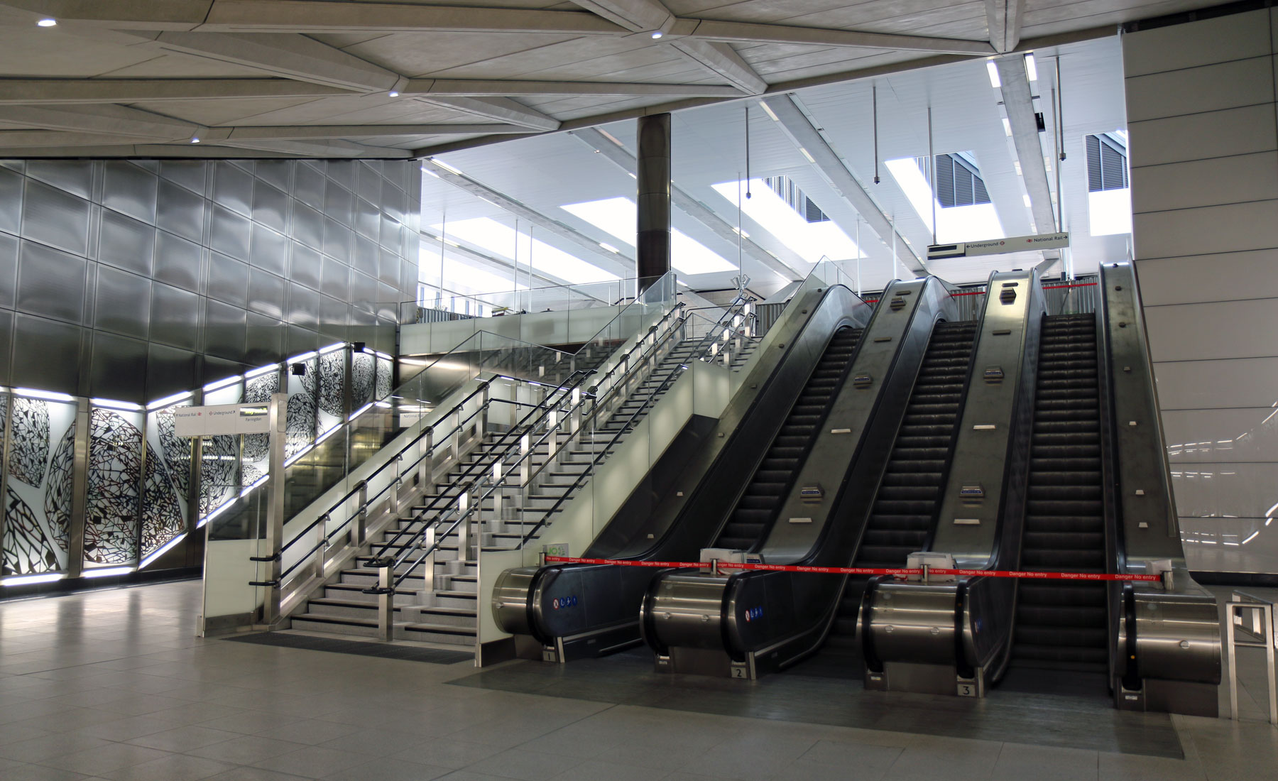
Once you get down another level, as with the other stations along the line, you move from the bespoke ticket hall design to the Elizabeth line aesthetic, with the curving concrete walls and simple minimalist spaces.
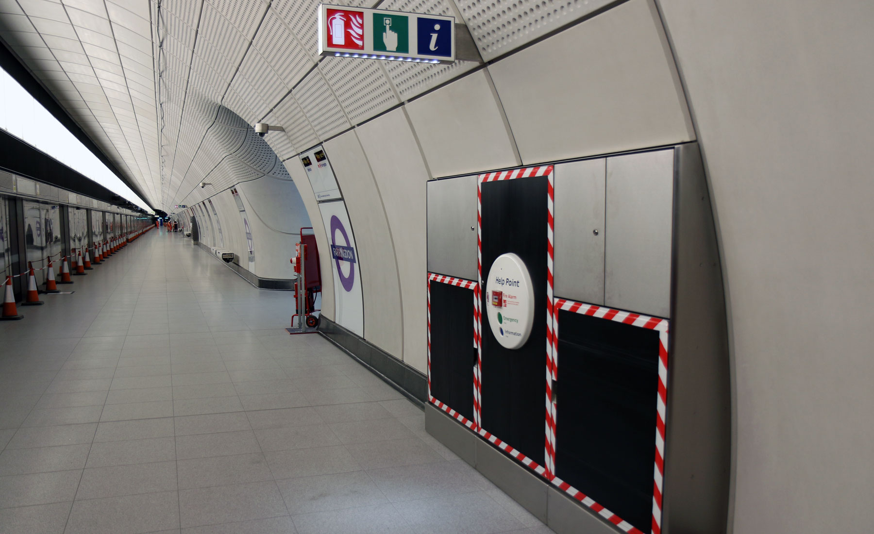
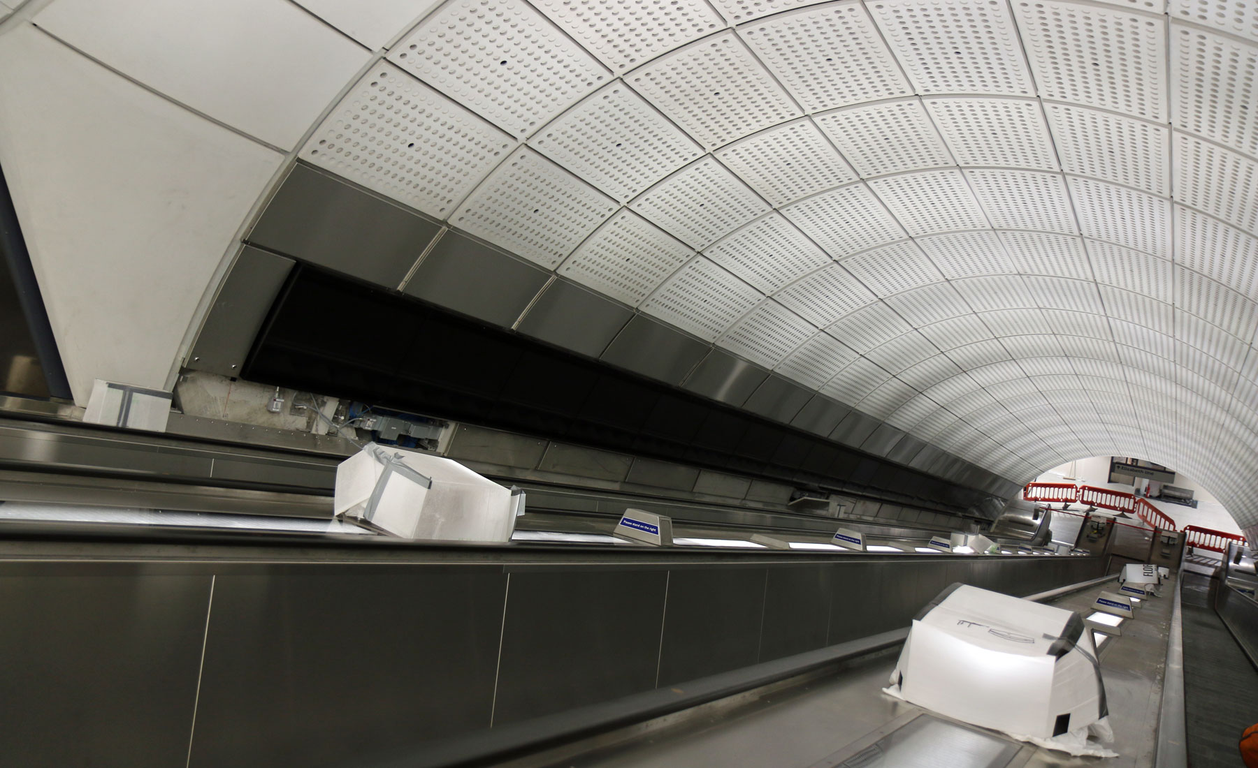
Farringdon station was the first to have the passenger side of the station finished to the degree that visitors doesn’t need to wear building site gear, and it’s the first I’ve seen where the lighting has been switched on along the full length of the platform, showing off very clearly just how long these platforms are. And wide – about twice the width of a typical tube station.

People arriving in the station at the Barbican end will notice that the trains stop a bit further down the platform. That’s because all the Elizabeth line platforms are a train longer than they need to be when it opens, to allow for the trains to be lengthened in the future. Here at Farringdon station, it’s a bit more noticeable as the trains will all stop at the Farringdon end of the platform rather than in the middle – as the main exit is at the ends of the platforms, and they expect around 80% of passengers to use the Farringdon end.
Although all Elizabeth line platforms are the same length, the ones at Farringdon are longer, in fact, the longest on the line, albeit the extra length being hidden in the back of site away from the passengers.
Normally staff tunnels are clean but basic, but here at Farringdon, the staff tunnels have been laid with public floor tiles. It had been expected that this might be an overflow tunnel for passengers, but plans were changed after the tiles were laid, so for the staff working here, this is almost posh.

Back on the platforms, one subtle effect is that the lighting on the platforms is warmer than in the corridors leading to the escalators which is a colder bluer colour — this should have a subtle effect on how people move, with people instinctively gravitating towards the warmer tones of the platform when they leave the escalators.
Another defining feature of all the central stations is the lack of stick-out signs. All the next-train signs are above the doors, so the platforms will look a less cluttered than a typical tube station.
One of the few signs that do point out are, understandably, the emergency signs, but look closely and not only are they positioned, as you would expect, above the help-points, but also they also have downlighters underneath to spot-light the person seeking assistance
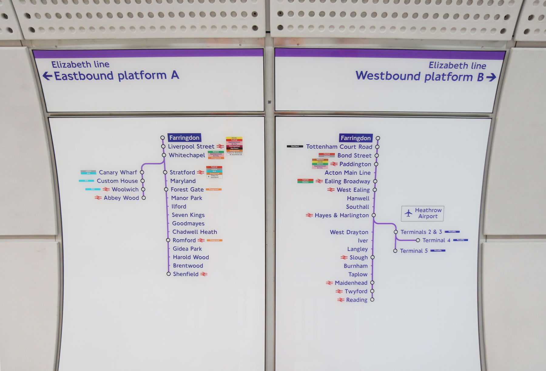
Line diagrams are up, and some have noted the lack of a Central line interchange at Tottenham Court Road, but as there’s a much easier interchange at Bond Street, that’s a deliberate decision to avoid long walks at TCR. However, while TCR was a deliberate decision, there is an actual mistake, albeit one that doesn’t affect the travelling public – if you can spot it at Liverpool Street.
Another “not a mistake” is the use of current edition tube maps on the platforms — these are just there for testing, to make sure that the maps fit into the spaces. May sound like it’s not the sort of thing that needs testing, but you can never be too careful – so they are tested. Just in case.
When the line opens, the maps on display will be the ones printed next summer.

A hidden in plain sight note are the car numbers — placed along the length of the platform to assist staff and emergency workers if they get a message that, for example, there’s a sick passenger on a train in the 4th carriage. Also, although all the new stations are step-free along the entire platform, at the older stations, they’ve ensured that the raised humps on platforms for step-free access are all aligned with car 5 on the trains. That provides a necessary level of consistency for people who need that facility away from the central core.
The lift shafts down to the platforms were dug down by Network Rail as part of the Thameslink project long before the Crossrail tunnels arrived, and there was always a slight worry that they wouldn’t be in quite the correct place. They were.
Something else down here that will remain probably forever hidden are the tunnel boring machine cutter heads.
Farringdon station is where the TBMs from east and west met, and when the two coming from the west arrived, they dug the station tunnels, then curved away from the stations. The bulk of the tunnel boring machines were dismantled and removed, but the massive cutter heads were buried in situ where they ended their long journey. A time capsule was buried with them on the highly unlikely but never to be ruled out chance that something else is dug at just those spots in a few centuries time and they are uncovered.
If you want to point at them, then head to the far Barbican end of the platforms and look across the tracks to the far tunnel walls and that’s their burial sites.
Here at the Barbican end is also a novel feature. While it has escalators and a lift, the lift isn’t the usual up-down variety, but an inclined lift that matches the angle of the escalators. A more elegant solution, and one that everyone will ride in at least once just to say they have.

Up at the ticket hall, it’s a much smaller affair than the Farringdon end, as it’s expected to be far quieter. It’s a modest square cube with recessed concrete ceiling. The floor tiles are the same yorkstone used on the pavement outside, not the Terrazzo usually used in London Underground stations, the aim being to blur the boundary between inside and out for the station.
The other unusual aspect to the station is a design feature, the entrance doors. Normally these are folding bostwick gates, but in this ticket hall, they are a much more solid affair with a slight barcode aesthetic. In fact, that proved rather harder to install than to design, as they are so heavy that special handles were required so they comply with LU regulations that it should be possible for one person to use them. The end result does look a lot smarter though.
The windows above with detailing from the nearby Smithfield markets are not just decorative, but have a very specific amount of frosted to clear glass ratio — to allow enough sunlight in, but not too much to cause solar glare. It took a lot of work to achieve that ratio, so again, what looks superficial is actually very complex.
The design of the ticket barriers is also slightly unusual, being two rows either side of the escalator instead of straight in front. That lets them fit in more ticket barriers, and also enables people to flow in/out of the station in the direction they are likely to want to walk when they leave anyway.

However, there’s something here that was not expected.
When the plans were made for the Barbican end of the station, it was expected to have a direct link to the London Underground platforms as well. That ended up proving too difficult to engineer into the space, mainly due to some listed buildings and other problems that while technically fixable, couldn’t be done at a cost that could be justified, especially considering the step-free Elizabeth line entrance would be just around the corner anyway.
What they have done though is keep some of what was initially built, and put in a dedicated lift shaft from the Elizabeth line up to the western platform at Barbican station.
It can’t connect to the eastbound platform, but it’s another hidden treat for tube geeks to say they’ve used at least once, because it’s there.
Officially, only Liverpool Street’s Elizabeth line station will link two LU stations (Liverpool Street and Moorgate), but unofficially, there’s half-a-link at Barbican/Farringdon.
You can be certain that will pop up in a tube geek pub quiz question in the near future.
Although looking nearly completed, there’s still a lot of validation work and testing going on to get the station ready to hand over to TfL. Lots of little things that wouldn’t be an issue anywhere else, such as small finger traps that crop up when things don’t quite align, which might cause a problem with someone getting a finger stuck once a century in an office, but with the numbers of people using tube stations, would be a regular occurrence, so need remedial work to remove. Fire safety systems are being tested and are nearly ready to hand over, and quite a lot of secondary works that have to be added as changes in the design and plans didn’t always factor in unexpected changes.
Just over a year to do until it opens.
Thanks to Andy and Kris at Crossrail for the site visit.
A few more photos:

Emergency staircases

All this needs to be installed by hand and tested by hand.

The top of the escalators at Farringdon end
Escalators showing the full length advertising screens.

Farringdon end central corridor between platforms
Line diagrams

Barbican end corridor between platforms


Platforms are a train longer than they need to be or a carriage longer?
I can see an error on the line diagram signs. The National Rail symbol should be shown at Farringdon as you can change to the Thameslink. And perhaps should also show the Circle/H&C/Met as you can get to them TWICE.
Not sure what’s up with Liverpool St.
Also, Terminal 4 isn’t right, it should be on a vertical line (after a 90 degree curve), not on a horizontal terminator. Urgh.
There is not Northern Line in Liverpool Street. Although there is one in Moorgate.
There will be a Northern line link at Liverpool Street, when the Elizabeth line opens.
“This should have a subtle effect on how people move, with people instinctively gravitating towards the warmer tones of the platform when they leave the escalators.”
But it won’t, any more than the dark floor in the vestibulesof tube trains ‘enourages’ us to move to the seats. Some will, some won’t. As for
“next-train signs are above the doors, so the platforms will look a less cluttered than a typical tube station.”
How the hell are passengers who arrive on the platform in a rush expected to see the next train? Weird.
In my dictionary, Central comes before Circle.