Tracking how people move around tube stations by following their smartphones has lead to a number of changes to TfL’s own travel guides.
The data collection, which began in July 2019, is harnessing existing Wi-Fi connection data from more than 260 Wi-Fi enabled London Underground stations. Although TfL has long been able to track people entering and leaving stations through their Oyster cards, and calculate their journeys, the interchanges inside stations couldn’t be monitored other than by manual counting, which is slow and expensive to carry out.
The Wi-Fi data adds the missing piece into the puzzle.
TfL notes that the data is depersonalised so that it has no way of knowing which individual is doing what, but they now have more than 2.7 billion depersonalised pieces of data to play with, and that has already been throwing up some interesting insights about how people use the network to get from A to B.
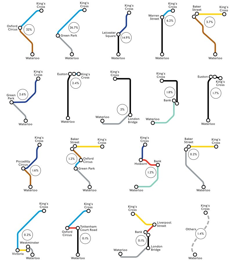
For example, a person starting at Waterloo has many different routes to get to King’s Cross, and the tracking found that many different routes are indeed being used.
Now that they have the data, it’s time to make practical use of it, and TfL’s first update has been to their website’s Journey Planner to more accurately reflect the time it takes to travel through stations.
Through collecting data TfL says that it has gained a greater understanding of the routes people take across the network, where they interchange and how long people may have to wait at certain points along their journey due to crowding or maintenance work.
TfL’s own in-house data scientists worked through the data and identified a number of situations where the time taken to travel through a station was longer than they had previously said on their website.
TfL has now adjusted Journey Planner timings for journeys involving 55 stations.

The changes are focused on stations where there are periods of time where crowds build up and slow down how fast (or slowly) people are able to get around the station.
Some examples include Canada Water, which in recent years has become hideously slow to get from the Jubilee line up to the Overground or the exits during rush hours. At high tourist areas like Bond Street, Covent Garden, Leicester Square and Piccadilly Circus, times have been adjusted to take account of higher usage outside of peak periods due to theatres, museums and other leisure activities nearby.
At stations towards the end of Underground lines in outer London, times have also been adjusted to take account of increasing passenger numbers.
Work is also underway to see what further information can be sourced from the depersonalised Wi-Fi data, such as understanding where customers interchange on certain key routes in London, such as King’s Cross St Pancras to Waterloo and Liverpool Street to Victoria, to see whether better alternatives could be suggested at busy times.
Unsurprisingly, the the aggregated data is also being used by TfL’s advertising partner, Global, to improve where it positions advertising and its ability to report back on how visible adverts are on the network.
Lauren Sager Weinstein, Chief Data Officer at Transport for London, said: “These changes to our online Journey Planner using depersonalised Wi-Fi data collection is just the start of wider improvements we are hoping to introduce which will provide better information to our customers and help us plan and operate our transport network more effectively for all. As we do this, we take our customers’ privacy extremely seriously. It is fundamental to our data approach and we do not identify any individuals from the Wi-Fi data collected.”
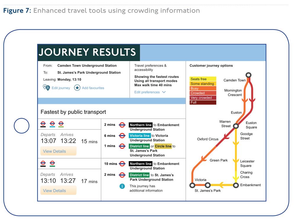
Work is now underway to improve data around crowding at platform level to help customers consider alternatives before they travel, and that is expected to be released as a public service next year.


“more than 2.7 depersonalised pieces of data to play with”
Is there some … multiple .. missing from this statement?
To be fair it does say ‘more than’!
Corrected – thanks
Let’s hope they use it to stop sending Olympia trains that no one ever gets on.
And to stop switching trains to different branches of lines when it’s clear lots of people are wanting the original destination (looking at you District Line controllers!!)
Thre are some really complicated routes some people are doing
who on earth does
Waterloo – Green PArk – Oxford Circus – Baker street – Kings Cross?
Apparenrly 1.2% of people do!
That’ll be Ian and Diamond Geezer….
Was there any time frame given for when the journey planner map showing alternatives and seating availability would be released?
Nope.
Proofreading note: “Tracking smartphones is helping TfL update it’s Journey Planner” – you should really correct the “it’s” (contraction of “it is”) to “its” (possessive of “it”).
It would be great if tfl here, and elsewhere, could include the number of steps involved for all of us who are less mobile (dodgy lungs, legs, etc – or just have luggage or a buggy).
Like all these documents with accessibility information on the TfL website… https://tfl.gov.uk/forms/12387.aspx