A memorial to the genius who designed London Underground’s famous font just over a century ago has been unveiled.

Edward Johnston, CBE (11 February 1872 – 26 November 1944) was a British craftsman who is regarded, with Rudolf Koch, as the father of modern calligraphy, in the particular form of the broad-edged pen as a writing tool. He is most famous for designing the sans-serif Johnston typeface that was used throughout the London Underground system until it was redesigned in the 1980s. He also redesigned the famous roundel symbol used throughout the system.
To commemorate his dominant contribution to the streetscape of London, a series of letters carved from stained wood have been placed along a wall in Farringdon station and were shown off for the first time earlier this week.
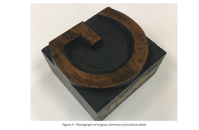
Designed by Fraser Muggeridge, the artwork extends along an entire wall in the station, and is inspired by the type pieces used in a printing press.

The giant wood type (at type height) spans an entire wall of Farringdon Station, and is designed to look as if it was found in an old store and simply mounted to the wall. Although it looks like just the alphabet rendered backwards, look closely and you’ll realise that it spells out Johnston’s name backwards in the layout.
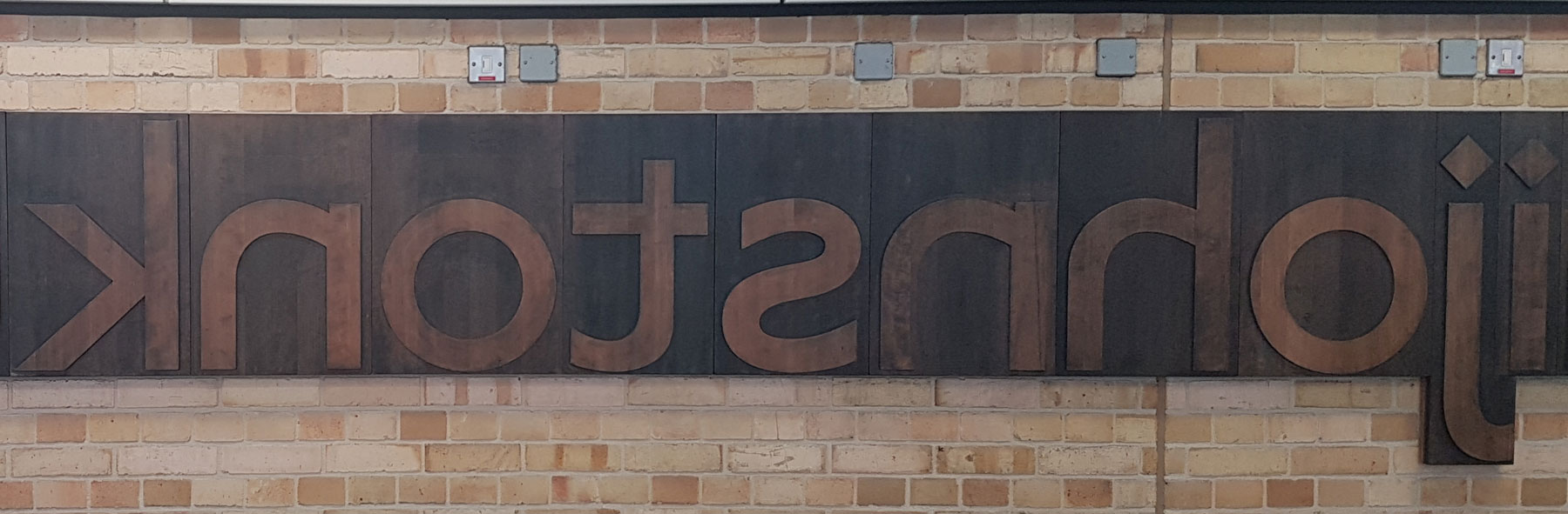
The letters have also been inversed to reflect how they would have been produced for printing purposes.
(c) TfL planning application
Using the dark stained wood allows for a tactile experience, the aim being to encourage people to interact with the memorial.
A member of staff walking past the evening after it had been unveiled was unimpressed, wondering why it was backwards and why they make things complicated. For me, the backwards print is not just a reflection of the blocktype used, but also makes the arrangement stand out a bit more noticeably, causing people to stop and think… isn’t that backwards? And then wonder why.
The designer, Fraser Muggeridge founded and is a tutor at Typography Summer School and also runs a design practice just up the road from Farringdon station. He has done work for London Underground before, and also written about the Johnston font.


Another trip down memory lane. If only the blocks had been that size at the school printing club. The time spent hunting on the floor for the only capital K left. Oil, grease and hissing machinery ~ fantastic.
How long before some group inks this lot up and rolls along it in white t shirts?
I apologize for being pedantic, but “a series of letters carved from stained wood” — I saw the Thomas Mayo prep photos on Instagram, and I believe it’s more accurate to say that it’s a “a series of carved wooden letters that were then stained.” https://www.instagram.com/p/ByaZ4eWB_Q8/?utm_source=ig_web_copy_link
Instead of apologizing for being pedantic why not just stop? You have taken pedantry into the stratosphere with this comment.It’s pretty ridiculous.