You might have seen some new signs popping up around the tube stations recently showing off London Underground’s heritage.

You might have thought they are a nice touch and enjoyed reading them. Some of you might have grumbled that TfL should spend the money on improving the service and not wasting money on showing off its heritage.
But, there’s a very surprising reason for the new posters.
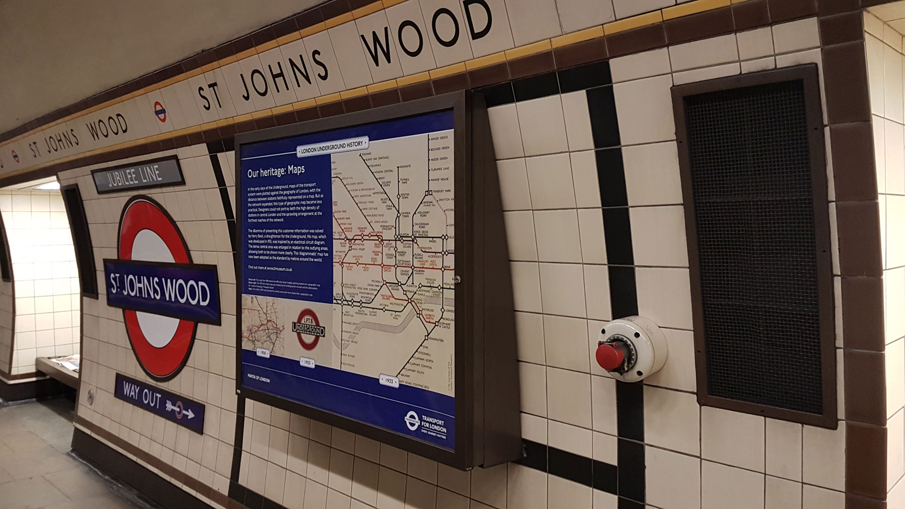
Look carefully at the posters — they all replaced tube maps. Every single one of them fills a space that was occupied by a tube map. Now, look at all the other tube maps on the platform… spot anything?

All the other tube maps are behind glass, but on each platform on the Underground, one special tube map was specially laminated and wasn’t put behind glass. The new heritage signs are also laminated and not behind glass.
So why are some behind glass, and others not, and why would it matter?
The secret is in the poster frame.
On each platform, one particular poster frame hinges outwards, and when stations are closed for some reason during operational hours, they display a warning sign to the train drivers.
Now the issue is that the design of the folding out signs didn’t include the glass protective sheet to keep the maps clean, which you might think of as a nuisance, but that’s all? In fact, it turned out to be a surprisingly expensive problem.
Any printed material placed in the tube platforms has to comply with a fire-resistance regulation known as S1085, which covers flammability, smoke emission and toxic fume emission in case of a fire.
A poster placed behind a glass sheet which is itself rated as compliant is perfectly fine. But a poster mounted directly onto a sheet of metal, with no protective glass would be a problem. Replacing all the flip-out signs with designs that added a sheet of glass would have been very expensive.
So, every time new tube posters are made — which is roughly twice a year — all the paper posters are swapped over and placed nice and snug behind glass sheets. But, a special batch of just a few hundred posters have to be made for the flip-out signs, and they require a specialist production process involving fire-proofing and lamination.
All that work just for one tube map per platform.
And get ready for this… those special posters cost around £21,000 a year to produce.

A few months ago, at one of their regular maps planning meetings, the map makers inside TfL turned to these annoyingly expensive maps, and someone thought, what if we got rid of them and put something long term on those flip-out panels. Then it was thought it would be nice to put up some heritage signs instead.
London Underground has rightly been showing off its heritage in recent years, and people are showing increased interest in tube history. So, plans were put in place, and a series of heritage signs produced, focusing on six core themes.
Maps, Signalling, Station architecture, Trains, the role of women in the company, and the District line (for it’s 150th anniversary).
Over the past few months, the poster fairies have been out and about visiting stations at night and swapping over the old tube maps with new heritage signs. Most of the District line stations got the District line heritage signs, and the rest scattered around the network.
Not all the stations though.
Although 216 stations had enough “maps behind glass” to have the laminated map swapped out for the heritage poster without the public being left bereft of maps, the remaining 54 stations are lacking in existing maps, and removing the laminated map could leave some platforms with insufficient maps to meet standards.
So they are putting up new frames on those remaining stations over the next few months to house tube maps, and they will also then get a heritage poster put on the flip-out panel, just like all the other stations.
So, the rather unexpected reason for all those nice new heritage signs that are springing up like mushrooms across the network — is to save money.
The stations are now adorned with pleasing information, and TfL saves around £21,000 a year. Money that can be pumped back into the network.
And I bet you never expected cost cutting to be the real reason for the range of new posters.


The poster-fairies haven’t been quite as benevolent as you make it sound.
They covered over all the “annoying expensive maps” at the start of December, even at “the 54 stations lacking in alternative maps”.
Additional frames to display replacement maps will only be added “over the next few months” – they’re not in place yet.
A decision was made to obscure perfectly-usable fractionally-out-of-date tube maps before suitable replacements could be provided.
The new heritage posters are absolutely splendid, but leaving 20% of tube stations with insufficient maps on their platforms for several months is a failure of project management, not a reason for applause.
Hi Geezer, I think the author says this is on hold for the stations ‘with insufficient maps’.
Personally, I am more reliant on Citimapper than the maps.
Great article.
DG modestly left out a link to his article on this topic back in December (http://diamondgeezer.blogspot.com/2018/12/tubemaplessness.html) in which he surveys a number of stations, and finds many have had their laminated maps replaced with the heritage posters already, leaving many platforms deficient of maps.
Not quite so “on hold” as suggested.
You are right, many people rely on their smartphones. But also many don’t.
Interesting article. Nicely written. Thanks.
That’s quite handy to know – thanks!
Sometimes if you want to know what direction the train goes in, you can find the flip-out frame and work it out based on the hinges. I now know to look for the heritage sign in future, not the map!
But what about when transport history is revised in our post-Brexit apocalypse?
This is why the London Underground is the world’s best transport system and millions of people who use the tube are people who live in London or commute into London from places outside of London. And even tourists visiting London that use the tube. And it has celebrated its 150th anniversary back in 2013. Which is why people love London. Because of its Underground transport system and the Jubilee Line, Waterloo & City Line, Northern Line, Bakerloo Line and Victoria Line passes underneath the River Thames. And District Line passes over the River Thames to the west.
And there’s me thinking they produced maps with newly opened Elizabeth Line on !
I’m not a trainspotter but I loved this article. So interesting and well written.
Excellent article !
I wonder how much the project to work out a way to save 21k a year cost?
LU is good at these headline money saving ideas, but much better at wasting huge amounts and getting away with it.
I think a well done is in order, it’s a fantastic idea and whatever the disruption we can rest easy know it a small price to pay and only a temporary glitch to what is otherwise a great idea!
If I had a criticism it would be this, while I think it’s fantastic that tfl are looking at ways save on the production of what could be deemed an unnecessary expense, what’s missing for me is what they plan on doing with the money they save! The right thing to do is to give it back to the customers that paid for their entire infrastructure, however I’m not sure that will be the case, so far this article to me has done little but celebrate an increase in profit, fantastic for tfl but how does that benefit anyone else? I could of course be a little too critical here but the bottom line is I would like to know more about what tfl plan to do with their savings! because I won’t celebrate them lining their pockets and asking London to pat them on head for it.
TfL doesn’t make a profit — quite the opposite in fact, and it has around £10 billion in debt.
My local station has the heritage poster. However right next to it there’s what looks like a standard commercial advertising poster (large and landscape). How does that manage to meet the fire regulations, without being behind glass? Are they specially laminated, or made of vinyl perhaps?
Hi Frankie,
I am not certain, but I believe that it is because the poster is fixed to the wall with paste.
The wall will provide a ‘heat sink’, which would not be the case with a poster loose in a frame.
That said, I think it is a bit tenuous, especially as the trackside adverts typically build up layer on layer over the years before being properly stripped back.
But, ultimately the amount of fuel in a typical Underground station is very small, and even without the Regulations and standards, LUL and the wider industry (which includes me) are unlikely ever to forget the King’s Cross fire
Posters trackside are totally removed prior to their replacement they are self adhesive and you no longer get bill on his ladder with a pot of wallpaper paste. Prior to the new coverings and 1987 the King’s Cross fire they used to be paper and we’re regularly just pasted one on top of the other. Kings Cross brought about a raft of changes from wooden escalators,radio systems, spoke heat detection and suppression and even the posters were subject to the new rules with there being a maximum 4 layers being permitted. The lives lost at King’s Cross won’t be the last on stations but they have made the travelling environment much safer for all who follow. It’s up to us to make sure we keep improving the systems both the operators and customers to honour those who sadly perished.
Satiated am I.
Thank you Ian. This type of reportage is what drew me to the delights of the Ian Visits window on the world in the first place. A little article on an obscure topic such as this; nicely balanced, sufficient depth of info and concise. Who’d have thought that such a study would elicit more than a dozen comments?
Now if only I could be so concise.
I went BACK on myself to get out at Stockwell to read a poster about signalling the other day.
Researching for the 1940s underground themed cocktail bar Cahoots, based in Kingly Court be Oxford Circus.
Really exciting to learn more about the rich heritage.
Is anyone missing the tube maps though?
At the station I use most frequently, these heritage posters have been placed down the far ends of the platforms to where most people go (ie away from escalators in the centre). Is it me being cynical that these replaced advert spaces that were not generating enough revenue?
Very cynical — as the placement is based entirely on the location of the station-closed sign.
I like thisbartile!
Well steuctures and easy to go into details. I was also wondering the meaning of those heritage pictures in tube station. I took a picture, as well. Thinking that the main reason was just an ad for the visitors it turns out that isn’t one of it. Which makes me feel happt now, knowing the real meaning.
If you like the heritage signs, I can recommend a walk along the South Kensington tunnel linking the Underground station to the museums. There’s a load of them there.
Some of the more recent Station Closed Boards have glazed frames which can display paper Tube maps or 2 double royal posters.
As new signalling systems are installed there is no need for them as trains can be instructed to run through the station at reduced speed without stopping.