Bethnal Green tube station is notable for three things – a disaster, a clock, and some tiles — and today I am going to talk about the tiles.

Bethnal Green station is one of a handful in London to have been given a very specific additional decoration to the classic cream tiles and name strip. Easy to miss, but dotted around the station are a series of tiles with raised motifs on them, representing aspects of London and places that the Underground visited.
The tiles were designed and made by Harold Stabler, who co-founded the Staffordshire pottery form that was to later emerge as the art-deco specialist, Poole Pottery.
The company produced much of the ceramic tiling used on London Underground stations built in the 1930s, and specifically for this article, the ceramic reliefs designed by Harold Stabler, who put a little S on the tiles as his signature.
His significance within the design world is often overlooked, as in 1915, with Ambrose Heal (of Heal & Son), C H St John Hornby, (of W H Smith & Son), Ernest Jackson, W.B.Dalton (head of the Camberwell School of Arts) and others including Frank Pick (of London Transport), he co-founded the Design and Industries Association. Their aim was ‘to improve the quality and fitness of goods on sale to the general public’ and their slogan was ‘fitness for use’.
Stabler was to remain closely associated with Frank Pick for many years.
In 1922 he was asked to create a rabbit mascot based on the Wilfred the Rabbit cartoons, and the rabbit was to appear on nearly 80 bus routes around London. The rabbit even became a collectable, with pottery versions made for sale.
He also produced the first official seal for the London Passenger Transport Board, a cap badge design, tiles and alloy ventilation grilles for Manor House, Turnpike lane and Wood Green tube stations. He also designed many posters for London Transport and Underground Group.
And of course, he designed the tiles at Bethnal Green tube stations.
The tiles were refurbished in 2006 using replicas supplied by CD Jackfield.
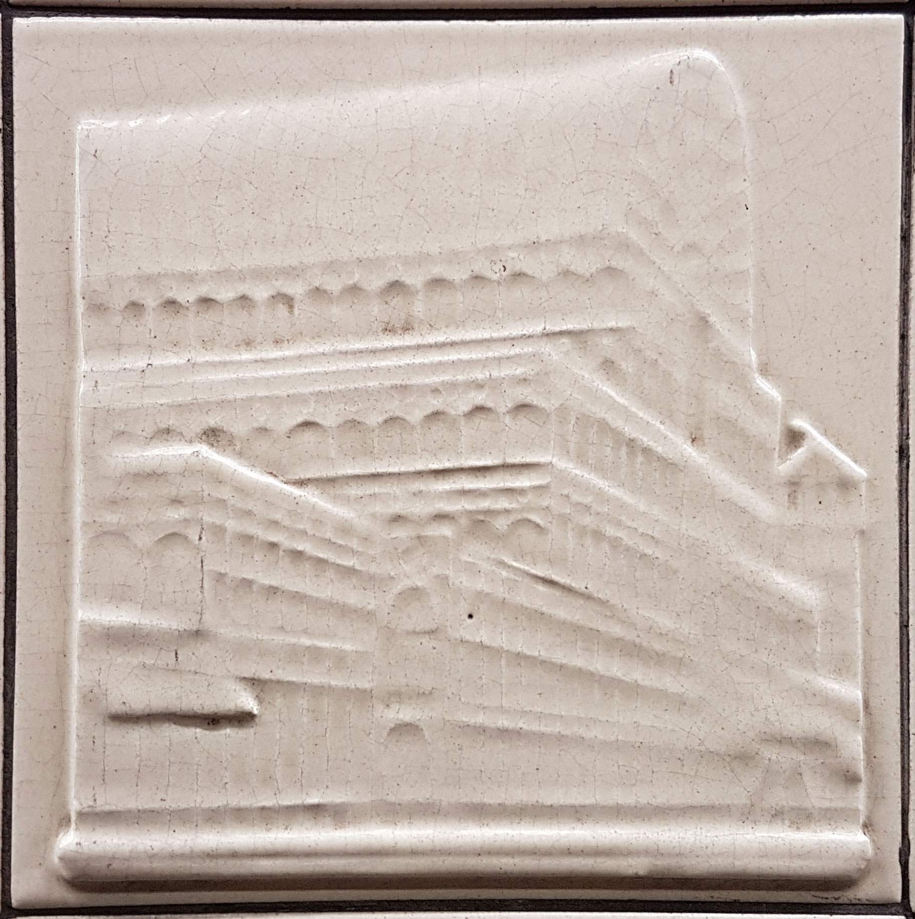
Unsurprisingly, one of the tiles he designed shows London Underground’s headquarters building, which was still at the time one of the tallest buildings in London.

Just one tube roundel appears in tile form, maybe it was felt that with the much larger roundels elsewhere, this might be overkill to have more.

The Palace of Westminster is here, showing the aspect that was common at the time, but far less so today — with Victoria Tower in front and Big Ben* in the background. Today it’s much more usual to see Parliament from the other side with Big Ben given prominence.
The three symbols are a curiosity — two crowns and a hat. Maybe for Monarch, Peers and Commons?

Slightly odd to have here is the Crystal Palace, as the London Underground didn’t go anywhere near it. This is also an usual tile in that it lacks the small S cypher that appears on the other tiles — by the artist Harold Stabler RDI.
The remainder of the tiles are heraldic representations of places that the London Underground is associated with.
The swan with a crown around it’s neck is the symbol of the 2nd Duke of Buckingham, later used for the County of Buckinghamshire, and also included in the Metropolitan line’s own Coat of Arms.

Five monarchs with three lines. This seems difficult to work out – could be for Berkshire, as the closest match I can find is the ancient crest for Reading, but that’s not quite the same.
It’s a bit of a mystery.

Five bird flying over the waves. Reputed to be five gulls over the Thames.

Five more birds, this time seem to be a representation of Westminster Abbey/School, which is made up from five martlets. Some suggest its Sussex, but that has six birds, not five.

Three swords and a crown show the Coat of Arms of the County of Middlesex.

An eagle, which comes from the ancient coat of arms for the city of Bedford, latterly the County of Befordshire. You can just about make out the castle around the neck that is also represented on the Coat of Arms.

Acorns surmounted by a crown is a stylised version of the Coat of Arms for the County of Surrey.

The lion and waves is here to show the Coat of Arms for the County of London.

A horse is probably from the Coat of Arms for the County of Kent.

The hart represents, unsurprisingly, Hertfordshire — the symbol of the hart over water is for a water ford, a pun on the town of Hertford’s name.

And finally…
A griffin, which comes from an old design by Eric Ravilious used by London Transport. Although it wasn’t used a lot externally, it appears on internal documents, and was used extensively by London Transport Catering right up to the 1970s.
The Griffin also appeared on badges worn by the London Transport Home Guard during WW2, and buttons worn by bus conductors.

You can also find more tiles in different designs in some other tube stations, Aldgate East, St. John’s Wood and Swiss Cottage.
*yeah, yeah, whatever.


These tiles are found at lots of stations that were built in the 1930s, such as Swiss Cottage and St John’s Wood. The Capital Transport book “Underground Heritage” has more about them, as well as the other tiling around the network.
Perhaps the five kings in a cross are Kings Cross ?
Thanks! I suppose the latest ceramic features would be the Gryphons at Bank/Monument!
Fantastic tiles! Brilliant article. Thank you Ian.
With the little knowledge i have i can conclude that all the tiles are occult symbols and the birds and what looks like heads of kings are in a succession of 5. Number 5 is associated with Babylonian goddess Ishtar and the Roman parallel Venus and certain geometrical 5 sided figures are central to occultism but then again it could just be some decorative pieces of art for all to admire whilst waiting for a train.
Quite a few of the tiles don’t seem to have an ‘S’ on them, and the Griffin appears to be a definite ‘G’. Or maybe it’s just me…then.!
Only a monarch wears a crown. Peers wear a coronet.
An interesting point about the swords on the coats of arms of Middlesex and Essex (the Middle Saxons and the East Saxons) that I have only just learned, and might as well pass on. They are not scimitars as I had assumed, but specifically Saxon swords or knives, known as seaxes. And their use as coats of arms for those areas dates back to those times.
Wikipedia has more about the seax.
Reading has five heads on its arms, true, but only the one in the centre should be crowned. It has variously been mens or womens heads at different times. To either side of the central crowned head are the letters R E.
I tend to go along with the King’s Cross idea.
Berkshire didn’t actually touch the County of London or indeed Greater London until 1974, when Wraysbury was transferred from Buckinghamshire to Berkshire. Further, Berkshire has its own symbol: a stag feeding from am oak tree, used as the crest of the 1947 county arms, but much older in origin. The main shield (achievement) is a pair of lions much like England’s Three Lions, but I don’t know how old this is, it may have been a 1940s invention. See http://www.berkshirehistory.com/odds/arms.html.
Bedford is a town not a city (unless it got city status when I wasn’t looking!)
Really interesting article. Thanks for posting
Still some people get confused with Bethnal Green Central Line tube station and Bethnal Green London Overground station.
Fascinating! Many thanks