For a couple of days, TfL dug deep into its archives and put a large number of maps on display.
The “Mapping London” exhibition was put on for TfL staff, to show off the development of mapping London’s various transport networks, and how planning is both driven by mapping, but how maps can change customer behaviour.
A large room filled with display boards filled with maps and charts and explanations.

Unsurprisingly, any display about maps has to start with the iconic tube map, showing off the various designs that lead to the current Beck inspired model.
Although overlooked for a while after he left the company, today you will see his name on all tube maps, the bottom right corner.
However complex the tube map is these days, and there are many complaints, spare a thought for the bus map planners, and their predecessor’s the tram route planners.
Maps of exceptional complexity, and in some cases, when you get down to the tram maps highly detailed plotting of power poles and tracks, beauty.
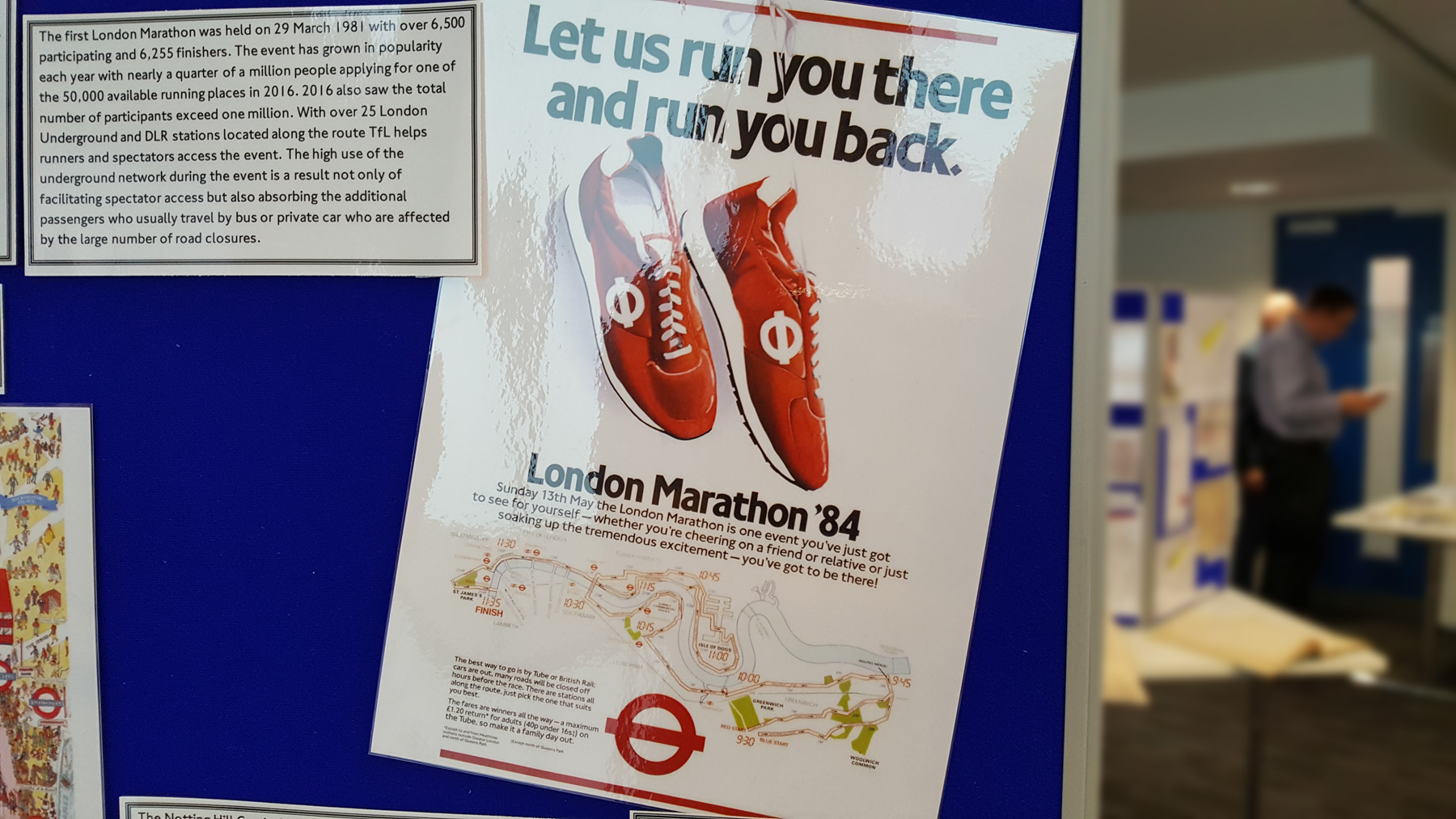
TfL doesn’t just do transport maps for everyday though, they also produce transport maps for special days. From a viewing area map for a public event taking place on a single day, such as royal coronations, up to huge events such as the Olympics, the range of tools offered to the public range from a simple feature map to an entire catalogue of published materials.
The end products look good, but what the exhibition was also showing off where the tools they use to produce the maps. Often bespoke tools and models are developed, which in turn later can be used to assist in improving mapping across the rest of London.
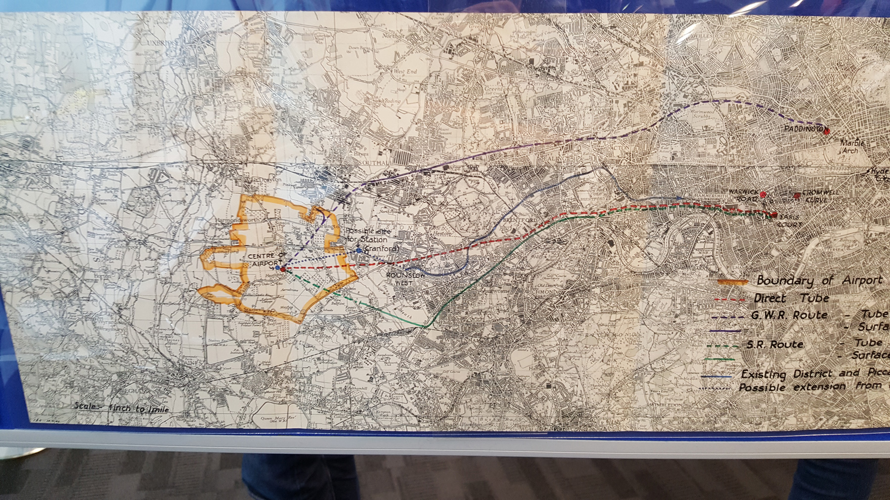
Maps are also not just to show where transport links go, but where they could go — so a lot of the display was devoted to predicting demand, such as mapping population growth, keeping an eye on property developments to ensure there’s enough transport to meet demands, and generally try to look ahead as to where new services should go.
Anyone who has ever read a planning document for a large development will know the vast amount of information that is collected about local transport issues, pedestrian flows and the like.
While necessary for the planning process, they have a curious beauty of their own, which is often lost in vast pdf downloads from local council websites.
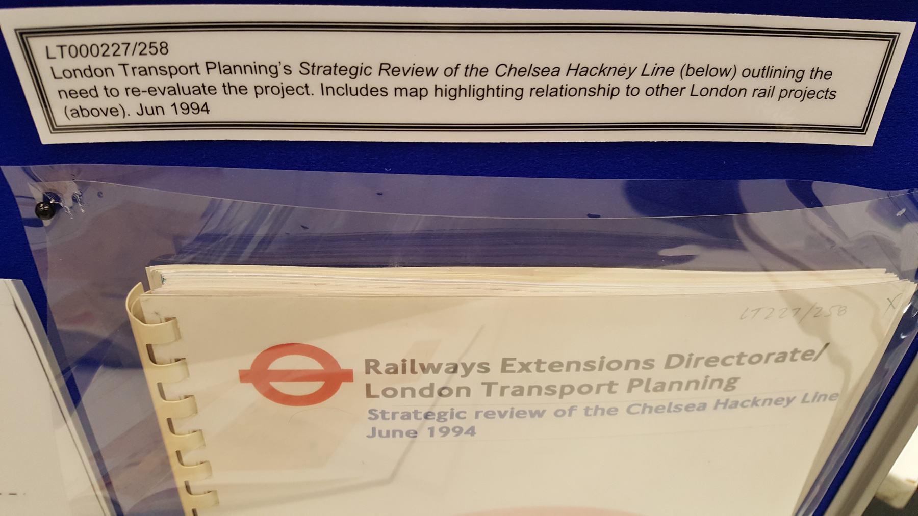
Some of the displays looked at things that were planned but never built, thanks to changing political whims and financial fortunes. The Bakerloo line extension for example having been on and off for the best part of a century, and what is now Crossrail 2 probably taking 60 years from concept to delivery.

Mapping is not just about getting people around, but also about assets, who owns what and where, so when things are planned, you know who to send letters to.
For example, it seems that 150 years of history has left a mess of confusion about who owned what bits of Smithfield meat market, which has a lot of railway running under it. With lots of works going on there, a major project was shown off where many lovely old Victorian documents had to be found and minute details extracted to show where ownership lay before any modern railway upgrades were possible.
The archive at TfL currently runs to over 155,000 files — each containing piles of documents, so that’s a lot of reading.
The display, while aimed at TfL staff was a good way of showing off the thinking that goes into something sometimes as seemingly simple as a street map, or why what seems odd is actually the result of careful design.
I was invited by TfL, and I have many notes that should spur some articles in the forthcoming weeks.
Personally, it’d be nice to see the display out in public one day, not least as your correspondent was quite ill on the day and didn’t stay half as long as he could have.


Maps produced for disabled travellers arent bad either