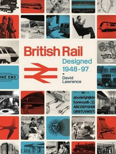
For all its many faults, British Rail was, for a while, one of the industrial design icons of the 20th century, and a new book has taken a look at how a state-owned monopoly was able to turn a collection of companies into a single dominant brand-name.
 Romping through the history from the time following nationalisation, British Rail Designed 1948-1997 talks you through the various phases of how the various independent companies were tied together
The political interference, in how they went from a squashed London Underground style logo under Labour to heraldic crests under Conservatives. From the Byzantine bureaucracy at head office to resistance to change in the regions.
It was however, not until much later following many failed attempts to impose a single brand identity, that in 1964, that the now famous double arrow logo came into existence, famously scribbled on the back of a scrap of paper during a morning commute.
It was the reviled Dr Beeching who approved the design. Coupled with the first ever brand-guidelines book which was itself revolutionary in the trade, this set in place the revival of the railway as a design icon.
Even if the trains themselves, and the sandwiches were more famous for not living up to expectations.
The book goes into really quite comprehensive detail about the locomotive engines, the minimal effort to introduce design elements into machines which were built by and for engineers first.
Unfortunately, while the reports are accompanied by photos, I feel that line drawings that demonstrated why a design choice was taken would have added a lot more information. As it is, a lot of imagination and prior railway knowledge is needed to make anything of the locomotive descriptions.
The architecture sections are on firmer ground, even if the level of detail in the detailing of the buildings can be excessive. Do we really need to know what sort of marble was used? Likewise for reports on uniforms. Is the fact that the braid is Russian a significant factor?
Back and forth through time. On moment you might be reading about 1962, then back to 1958, then jumping ahead to the 1970s. By splitting the book slightly, but not entirely, into themes, the chronology can be confusing.
The problem with the book, is that it has been written by a university academic, and it shows. Each chapter has a page explaining what the chapter will be about, and finished with a section on what the chapter was about. It’s detailed, but to a level that seems factually completest rather than insightful.
In reality, it’s three academic papers bound together — the trains, the buildings and the branding, then padded out with lots of photos. The photos are lovely, and the writing informative, but it leaves a hole.
The hole is the why. We are often told things happened, but not why, not the background, not the gossip.
We’re told that in the early days, staff working at disparate companies were reluctant to adopt the state-owned brand, but no real insights into the problems this caused.
Glasgow was an experiment in how to use branding to renovate a service, and there is much about a new logo, but is that all that was done? Surely something else happened, otherwise why was it considered such a success.
Too many facts, too few insights.
There is probably a really interesting story to be told — the human story. The politics, the office squabbles, the egos and personalities. The insights that go beyond saying something happened, and into the whys of how it happened.
Hopefully one day, all those interviews and letters will be turned into a thrilling rollercoaster of a book.
But not today.


I can only imagine the letters the author of this book will get from pedants if he calls something the wrong thing.