One of the so-called “anchor tenants” within the gargantuan shopping centre next to the Olympic Park is John Lewis, and they have set aside part of their new department store as a 2012 shop and viewing area.
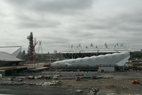
Since it opened, all the publicity has shown the viewing area as a large glass wall from whence you can observe the construction work on the roads and facilities, and see the spirals collective of the Orbit Tower slowly fattening out to its eventual shape.
What the photos never showed was that the viewing window is accessed via the 2012 shop, which is understandable, but where the view through the window is of a landscape dominated by black and white buildings, the view the other way is a kaleidoscope of colour as the London 2012 branding burns its way into the eyeballs and leaves you gasping for migraine tablets.
Even setting aside the fact that I think the branding is fairly naff, this shop would be an overwhelming experience regardless of what branding colours they had chosen.
There is a whole shop decked out in walls of Day-Glo colour, with every sort of trinket and cuddly toy you could imagine being offered for sale. Everything from a cheap pen to shockingly expensive collectable medals.
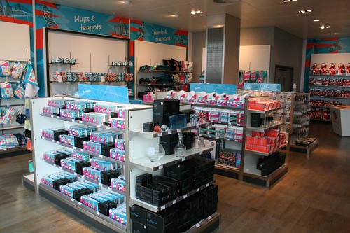
I have never seen a shop so utterly devoted to a single colour scheme and brand identity as this one has been. Even tourist shops tend to have a range of products with minimal branding to select, but where the brand is pre-dominant as this, it suffocates the products.
You can’t buy a coffee cup, but you can buy a huge London 2012 logo, behind which you might find a coffee cup cowering in terror at what has despoiled its glazed exterior.
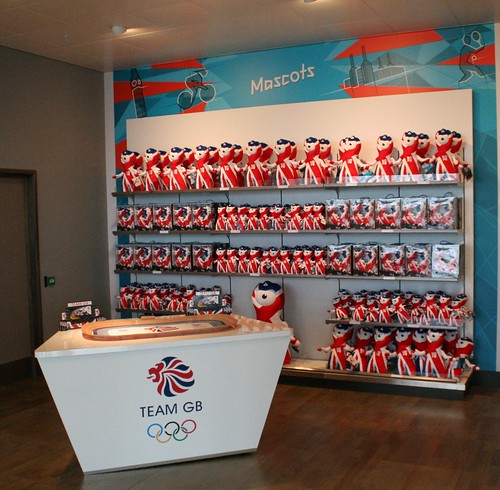
A large section devoted to Team GB has somehow turned the Union Jack/Flag (whatever) into something that would not look out of place as an invasion of Dr Who aliens.
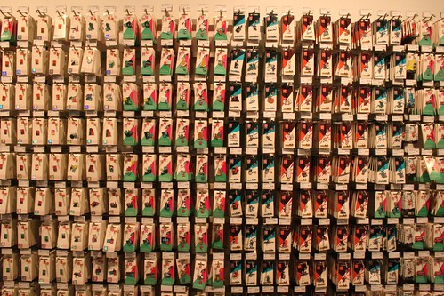
The only redeeming area, and more for its photographic qualities than anything else are the walls filled with collectable key thingies – which look almost like some form of impressionist artwork, if slightly hypnotic if you look at it for too long.
I feel sorry for the staff working here – they must go home and dream in magenta.
The viewing area is also slightly disappointing as it looks out onto the park through a number of anti-glare slats, so rather than a huge vista across the park, you are actually looking through slots in the glass.
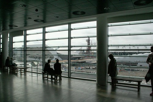
Doesn’t really affect the view that much, but does tend to distract from the potential that a huge viewing window would have offered.
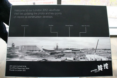
Oh, and I wonder what the sponsors of the ArcelorMittal Orbit Tower think about having their brandname omitted from the “what you can see from here” sign?


“I have never seen a shop so utterly devoted to a single colour scheme and brand identity as this one”.
In that case, check out the mammoth M&M’s store on the site of the old Swiss Centre, Leicester Square. Several floors of products, every one in M&Ms primary colours.
I suffer from bright-colours visual over-stimulation every time my wife drags me into Paperchase. It’s almost the match for the 2012 shop.
Oh yes, I’ve heard about that store – not seen it yet.
If you haven’t seen the M&M shop yet, continue to do so. It makes me a little sad inside.
You sum up how I feel about Apple Stores. They go for the opposite – bland uniformity and everything based around five products.
Back to topic, this seems very classy for John Lewis. Going out east has done for them!
Which floor of John Lewis was this on? I found the view to the Olympic Park in John Lewis, but it was in the middle of some bed/furniture department. Surprised they hadn’t made it into a café or something.
One of the upper floors, I wasn’t really keeping count.
possibly the most drivvel filled moany article in the world.olympics is the greatest thing in the world and a shop to dedicate even a shelf nevermind a floor to it doesnt come close to what it deserves.if you dont like the olympics why write about it,why not just go and read the bible or play chess,whatever miserable boring people do these days