A new tube map has been released showing a number of changes to the service, including the forthcoming partial closure of the Northern line.
There’s only a handful of changes to the tube map this time. Tottenham Hale, Sudbury Hill both gain step-free symbols, but the big reason for the new map is the closure of the Bank branch on the Northern line.
Rather than fading the line out, TfL has opted for a hazard style colour scheme for the line, of alternative yellow and black bars.
A yellow disruption box says “The Northern line will be closed between Kennington and Moorgate from Saturday 15 January until mid-May 2022.”
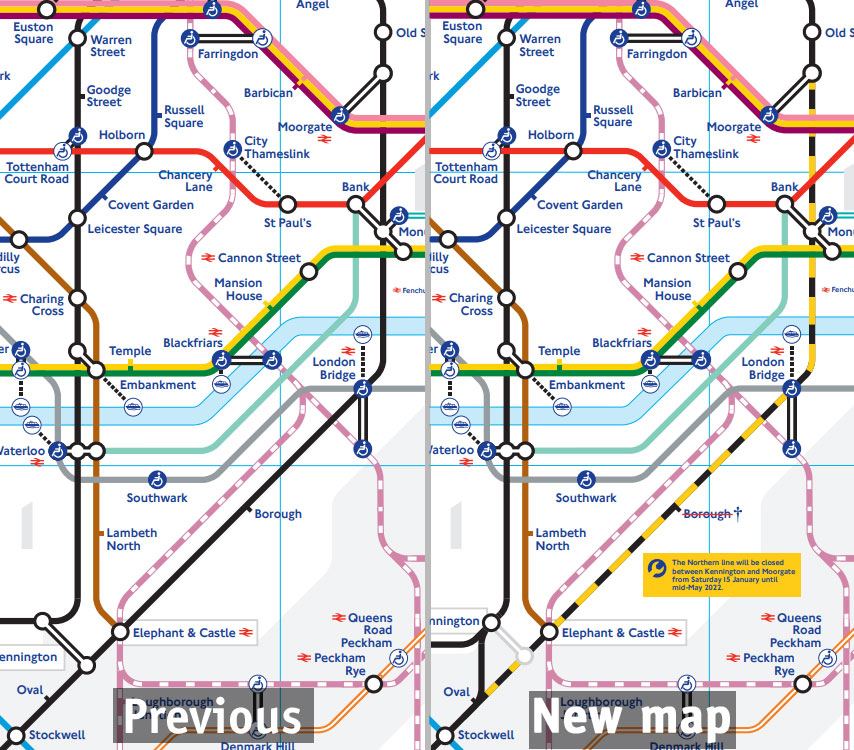
Borough station is shown as closed, as it can’t be used for anything else during the Northern line suspension.
The curious dangling end to the Northern line extension has been given a bit of viagra and is now a much neater straight line. The walking distance between the river services and Vauxhall has also been shrunk as a result of the tidying of that patch of the map.
A new link on the Northern line between Oval and Kennington has appeared, although they’ve left the interchange at Kennington with the closed Northern line bank branch intact, which seems an odd thing to have left in considering that it can’t be used.

Previous map

New map
Other minor changes:
The text for Heathrow closures has been changed from two separate messages about Terminal 5 and Terminal 4 into one single block of text.
East Acton has gained a dagger, as the eastbound trains and all Night Tube trains won’t call at the station until mid-May 2022 — this is due to platform works.
A tiny change in the bottom left key to symbols to split out a dividing line, and the bottom right has gained a tube roundel — although it’s specific to the Underground, and that does seem awkward at it’s placed next to the tram lines. The Underground roundel was always on the page, but below the map in the travel information banner — but that’s been replaced with information about downloading the TfL app instead.
Battersea Power station has gained a river service interchange symbol next to the tube station name.
The key to lines on the right side has gained a new line — showing the colours of the suspended Northern line.
The new tube map is here.

Previous tube map
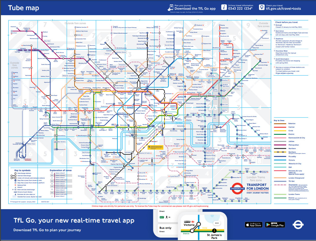
New tube map


No mention of the Mayor of London either.
The mess of Thameslink being bent round the Cannon Street station name just shows how far standards have fallen. Beck is spinning in his grave.
lol they fixed the northern line battersea stub so it doesnt end in a curl.
But theyve gone and added a slight bend now.
Maybe next time theyll get it right…just needs a straight line, guys.
Does this mean a new paper tube map is imminent?
pocket map released yesterday, new cover design
TfL need to remove Thameslink from the tube map. It’s not a TfL service and it makes a simple and very effective diagram of lines cluttered and very messy, especially with the Elizabeth line (a TfL service) being added later in the year.
Thameslink is there as an alternative for the Northern Line closure.
There’s been a long campaign to add it, partly because of the Northern Line closure. But if that line, why not all the other non LU lines as per https://www.nationalrail.co.uk/London_Rail_Tube_Map_September%202021(c).v5.pdf.
Incidentally this map is apparently not going to be updated for the closure on the Northern Line, but only when the Eliz. line opens. Not happy about that
It has a metro-style frequency, is fully integrated into the ticking system, and provides plenty of useful connections that TfL doesn’t. Users of the map don’t care that it’s not a TfL service.
Odd that Battersea Power Station Station doesn’t have a link to Battersea Power Station Pier as it’s shown as a link at the tube station and has a working RB1, RB2 and RB6 service…
It seems to have been accorded the same status as Putney Bridge. The distance between the tube station and the pier at Battersea is anything up to 15 minutes walk. The distance between putney Bridge tube and the pier is an eight minutes walk. QED.
Roll on the day when the current mess of half built roads and cut-throughs at the power station complex are fully finished. Currently, arriving at the tube station is nowhere near the end of your journey if you’re going to a restaurant by the power station. The journey between Vauxhall and Battersea on the tube is much quicker.
I am surprised that Battersea Power Station does not show a link to nearby Battersea Park (Station) as an Out Of Station Interchange exists between the two.
It has only four (?) Overground services a day.
How do you find all the changes?
I find myself imagining that you have images of the two maps which you rapidly switch between, looking for the bits which flicker, rather like how they find comets and asteroids.
Positively cosmic.