The big shake-up of the Elizabeth line linking up the core tunnels to the mainline services means a new tube map is required, and with a new map comes a new cover art design.
Apart from the obvious expected changes at Paddington and Liverpool Street stations for the Elizabeth line, there’s been a handful of other minor changes, and one big change in Southeast London with the layout of stations shuffling around.
The tube map differences in detail
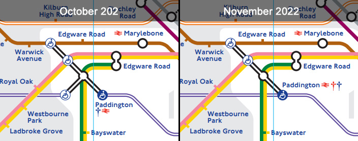
Paddington station
The station has been cleaned up a bit now that there are direct trains on the Elizabeth line, but has gained a second dagger in the process to indicate that services may vary — that’s because a tiny handful of early morning Elizabeth line trains start from the mainline platforms.
Bank station
The interconnections have been slightly tweaked to show the Northern line as being equidistant between the Central and Circle/District lines, which more accurately reflects the situation in the station

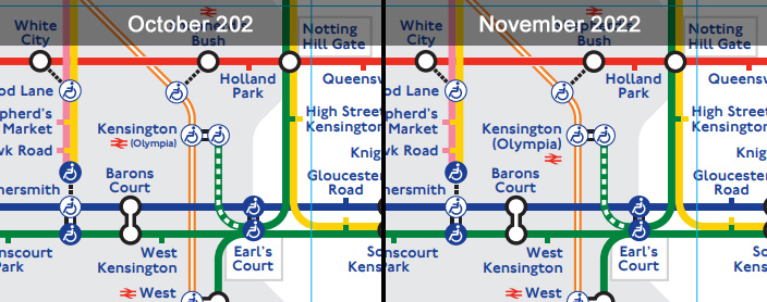
Kensington Olympia station
The map has changed how the station name is displayed
Liverpool Street station
As with Paddington, the connection with the Elizabeth line has been cleaned up, but the station still looks a mess, mainly due to the extra blob needed for the London Overground to show step-free access is from street to platform, but not onto the train.
The station also gains a dagger, for the same reason as Paddington.

Mile End
The Central line at Mile End has been tweaked to allow for the junction of the Elizabeth line, and Bethnal Green station’s name is now on two lines instead of one. The kink in the Central line is still there, but shrunk a bit.

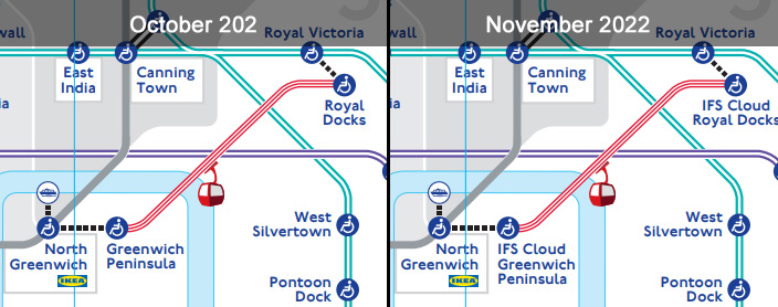
Cable Car
The cable car having dropped the Emirates branding for a few months has now added the IFS Cloud branding
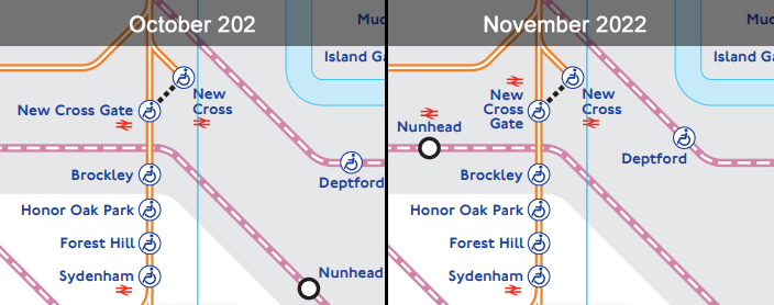
Nunhead
This is geographically probably the biggest change in the tube map in many years, as Nunhead station jumps sharply to the left moving from one side of Brockley to the other. That does more accurately reflect the placement of the station though, so a change that’s likely to be welcomed by local residents.
The change also means that the way New Cross Gate station name is shown has to be compressed a bit.
Deptford station also shunts westwards by a bit.
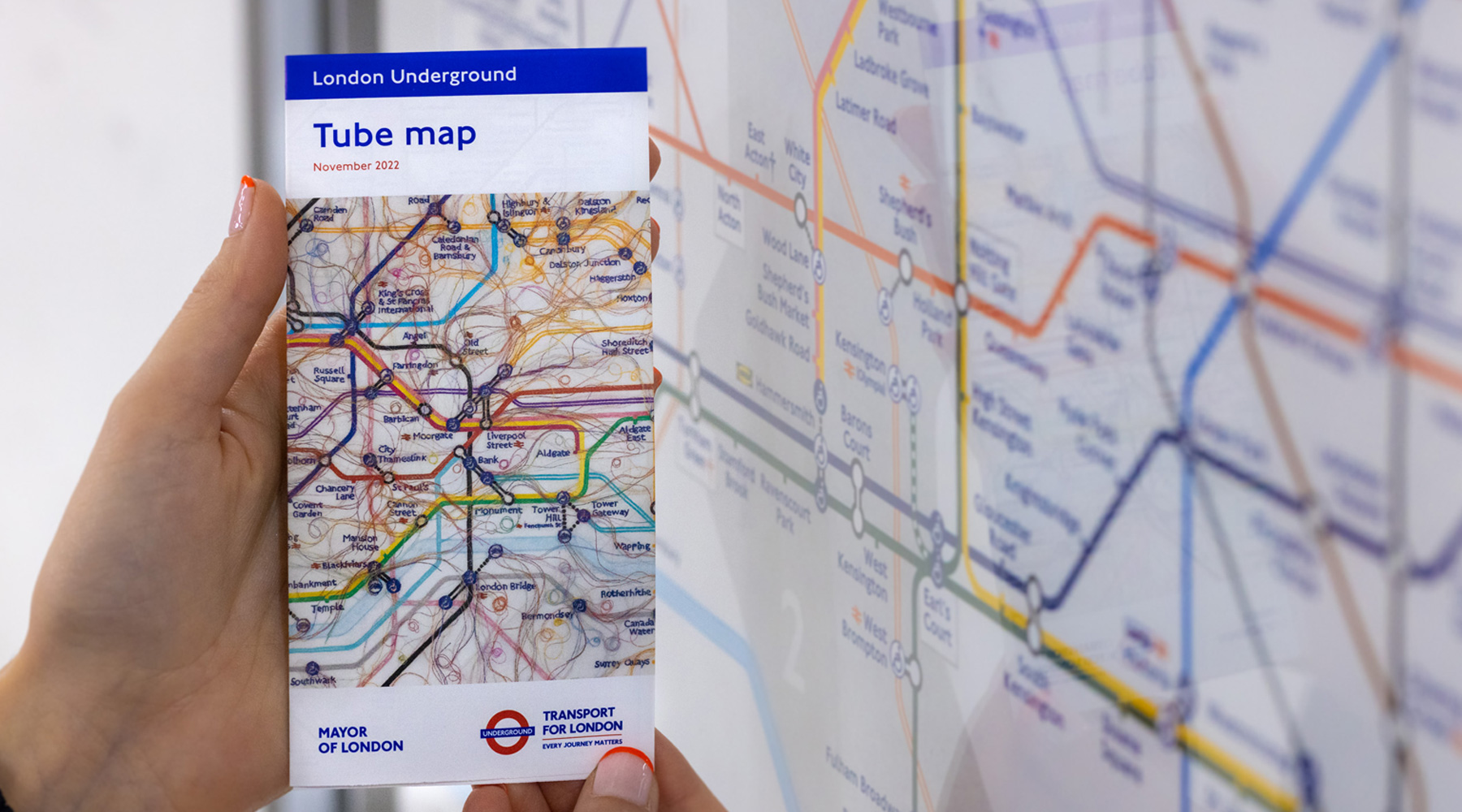
The new tube map cover art
The latest artwork for the tube map leaflets is by London-based artist Do Ho Suh, and is an embroidered facsimile of the tube map focusing on the routes that he habitually uses around his home and studio.
It’s supposed to show how the tube map is a dominant structure we use to navigate, when in fact many of our journeys are filaments between the stations along the streets.
It does admittedly look a bit “furry” though.
(c) TfL
Do Ho Suh commented: “For over a decade, I have put my roots down in London and made it my home – both of my children were born here – so it is a privilege to work on TfL’s iconic Tube map. At heart, so much of my work is about the transportability of space, about what we carry with us as we move through the world, so I’ve loved working on an actual map and thinking about the gaps between the locations and complicating the neatness of the lines.”
You can pick up the tube map leaflet at tube stations.

Tube maps at Woolwich station


Nunhead wasn’t even on the tube map this time last year, so it’s not “geographically the biggest change in the tube map in many years”.
Far bigger seismic shifts were the arrival of Thameslink in December 2021 (a comprehensive redraw) and the appearance of Barking Riverside in May 2022 (which completely rejigged the whole of Newham).
Unfortunately the good connection on The Elizabeth Line at Liverpool St station is still no clear.
At the west end of the platforms on the Elizabeth Line there is a direct escalator connection to Moorgate station for trains going to Welwyn Garden City and Hertford.
At the East end of Liverpool Street station are the escalators to the main line Liverpool Street.
So in fact Liverpool Street station on the Elizabeth Line serves two mainline railway stations but this is not clear even on the revised map, and certainly not on the line map on the trains.
Both stations are marked with the “arrows of indecision”, just like every other National Rail interchange, so it’s difficult to see what else could be put on the map.
I definitely think there was a case for naming the Elizabeth Line station Liverpool Street-Moorgate. There is also a case for not over-complicating things, this is a tube map after all and passengers using Great Northern will have the Elizabeth Line connection on their maps.
Wonder why they haven’t shown the connection between Barbican station and Elizabeth line (Farringdon station)
Because it’s not an official link
“ Bank station: The interconnections have been slightly tweaked to show the Northern line as being equidistant between the Central and Circle/District lines, which more accurately reflects the situation in the station”
This also now shows the Northern line at Bank as having step-free access, which might be the main reason for changing it?
I often walk from Warren Street to Euston Square stations as I feel it is easier than walking from Euston to Euston Square.
It also surprises me that Warren Street is shown on the map to be East of Euston Square, when in reality it is to the West.
Thanks for this interesting article. Can anyone explain why so many interchanges have a ‘double bubble’ rather than one? For example where the Overground runs from Romford to Upminster, why is the interchange at Upminster denoted with two circles whilst at Romford there is one? What does the double bubble indicate?
There are so many examples of this where the tube map would look neater with one circle (eg Woolwich Arsenal, Victoria, Blackhorse Road and Walthamstow Central). Or is there a good reason for it?
The map is such a mess at present!
Its indicating that there are different step-free access capabilities between the two lines.
Ian aah yes thanks that’s correct. On the TfL app you can toggle on and off the access information. When it’s toggled off the interchanges should be simplified!
I assume Tfl will no start to get the in-car maps updated; 6 months on from the Eliz Line opening many/most don’t even have it on them
Would it not be great if the Rail Network (circa 2019) map was still available. This shows on one side all the rail/underground/over ground stations and interconnections. Makes travelling in London so much easier. The reverse shows London and the south east connections
I asked at my local station and was told it is no longer printed – all the information is available online. So much for aking life easier. Anyone got any ideas ?
The map is available on the TfL website, and you can print out the PDF document at home (or on the office printer) if you want.
Find it easier and quicker to use Cannon Street on District/Circle line to get to Bank rather than use Monument Station. Just cross over Cannon Street itself and walk down Walbrook
I note that Euston has been “tweaked” so that the Victoria Line no longer passes through the Bank Branch of the Northern Line, which I always thought was a neat way of showing that the interchange between the two lines is one of the easiest on the network (just cross the platform). The new version suggests that the only (or the easier) interchange between the two lines is via the Charing Cross branch, which is not the case. And has anyway noticed that ‘Kings Cross St Pancras’ has become ‘Kings Cross & St Pancras International’?
The line to Nunhead crosses the other line between Brockley and Honor oak Park, not between New Cross gate and Brockley.