The Transport Museum in Covent Garden may conjure up images of old trams, buses and tube trains, but probably not the River Thames, even though it had been the main transport artery through London for most of the City’s life.
Today the river is more of a border between North and South, a corridor that offers pleasant walks and an unrealistically blue squiggly line on the tube map of such utility that its removal a couple of years ago provoked an outcry.
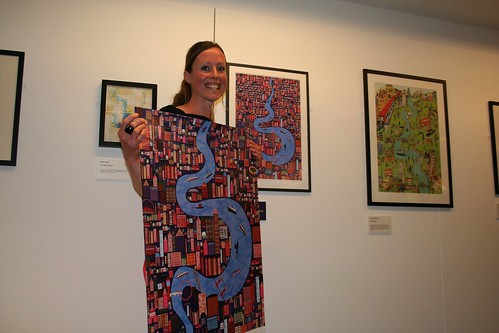
Last night marked the opening of an exhibition to honour the muddy brown river organised by the Association of Illustrators and sponsored by Serco, the people who variously manage the DLR, Boris Bikes etc.
There were also prizes to be handed out, 3rd and 2nd being an envelope of cash and 1st being both an envelope and the reward of having the poster appear in tube stations across London – and thanks to reproductions on coffee mugs – in kitchens across London.
Although I can see why the (visibly shocked) winner won, to be honest, it wasn’t my choice.
Looking around the gallery of about 40 of the top entries (out of some 400) there seemed to be two themes coming out strongly, those who drew representations of London, with the Thames – and those which were the Thames first and foremost. I also felt the latter were generally the better designs.
One interesting aspect is the aspect used by many of the drawings, who turned a line that divides North from South into a vertical barrier between Left and Right. Reminded me of a tube map done by Max Roberts which I saw last year that also flipped the map around to put East at the top.
Even the ones with the Thames at their heart often had obvious landmarks, mainly Tower Bridge to indicate their London centric nature – which I generally thought was a missed opportunity. Too few of them strayed outside Zone 2 for inspiration and the few that did lacked much context.
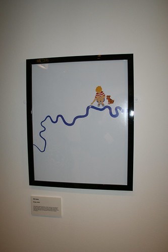
My absolute favourite was a very simple drawing of a child playing with a model boat in a stream that was in the distinctive shape of the Thames. The clean design and charming image really worked for me – it was slightly surreal, uncluttered and yet instantly recognisable as The Thames by any Londoner.
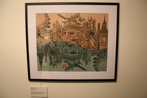
A drawing of London landmarks with a reflection below to indicate the river was breathtaking for its technical skills, although it was dominated by the landmarks with only a nod to the river in the reflection. A lovely drawing, that would probably sell incredibly well in tourist poster shops.
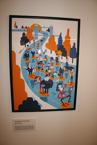
My second favourite of the evening though was this delightful image of stereotypical London people floating down the river on personal tube roundels. Although too many of the posters themed around the river had tried to feature transport in them – even though that wasn’t part of the remit – this one worked for me as it was so jolly and fun to look at.
If this had been the winner, I expect it would have raised a lot of smiles on the tube network.
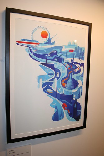
One of the few that incorporated city landmarks, but in a less aggressive manner, this slightly swirly image with the almost Japanese tsunami London Eye at the top appealed to me as my third choice out of the lot.
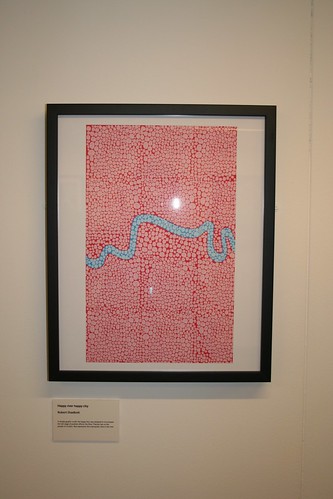
This initially simple design which at first glance I thought was a clever representation of blood flowing through muscle actually on closer inspection turned out to be hundreds of small smiling faces. Which then put me off it! One to admire from a distance.
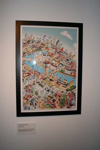
Although many of the posters were London first, with the Thames as a background, this one did work for me as the drawing of the landmarks had a somewhat fantasy city appeal to them. Instantly recognisable, and very detailed, but also slightly strange.
—
The exhibition opens today and runs until the 3rd June.
Overall, it is a good exhibition for anyone interested in poster design, or London in general and is free with the £13.50 entry to the Transport Museum (which in turn gets you unlimited return visits for a year).
Thanks to the Transport Museum for the invite, and Annie Mole was there as well, so expect her expert eye to comment shortly.
There is also a talk in a couple of weeks time on how the Thames has featured in London Transport posters in the past.
The winner!
The design contrasted the sharp lines of the stylised buildings with the curve of the river.


Er. I don’t think that’s quite how reflections work 😉